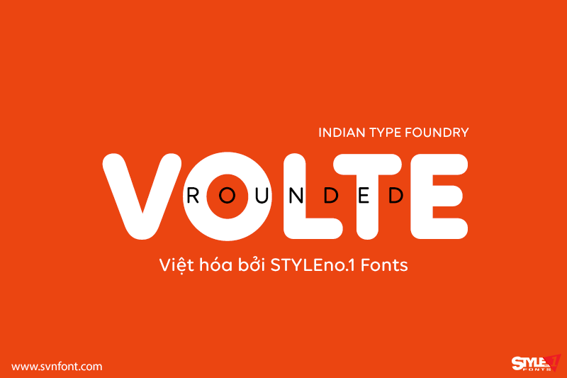
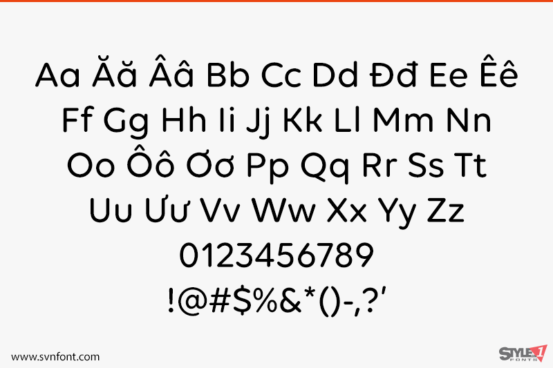
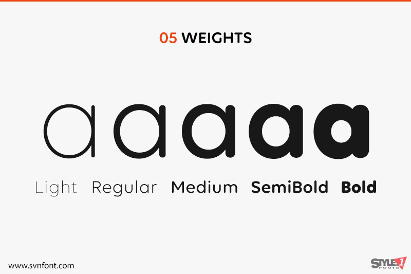
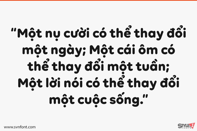
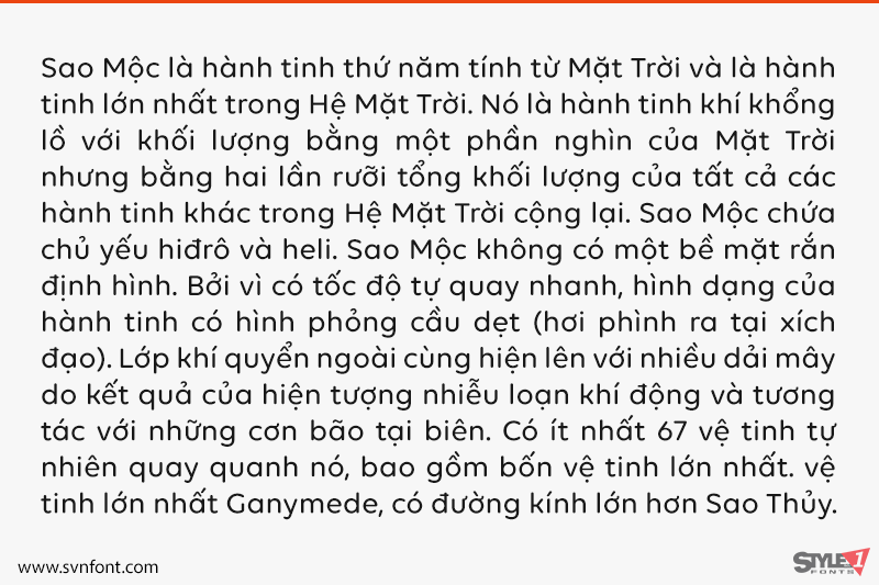
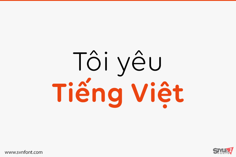
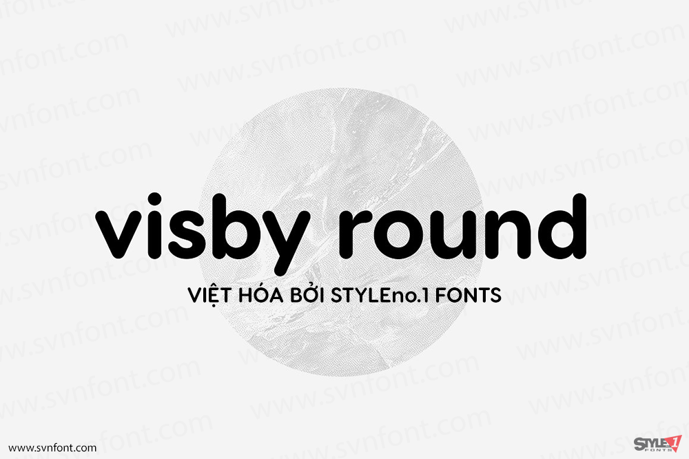
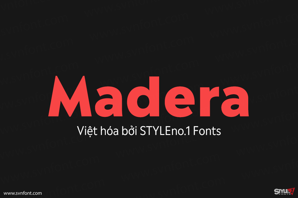
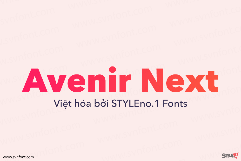
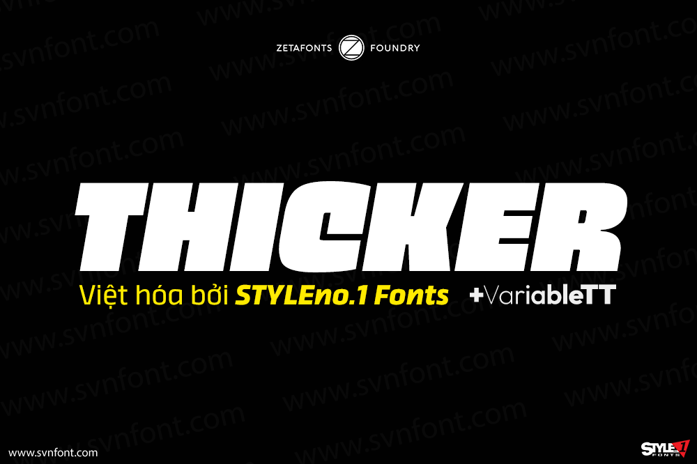
Volte Rounded is a geometric sans serif typeface with rounded stroke endings. These aren’t softened-up corners, but rather full-on sausage-style terminals. Aside from geometry, reduction is the biggest principle behind Volte Rounded’s design. Volte Rounded’s letterforms are low-contrast, even in the bolder weights. The high degree of design simplification is even visible in the typeface’s diacritics and punctuation marks. Because Volte Rounded’ proportions are so geometric, the outer shapes of letters like ‘C’, ‘D’, ‘O’, ‘c’, ‘o’, etc. are very similar. The exterior curves of the ‘O’ and ‘o’ are close to being perfect circles, too, as are many of the typeface’s counterforms. In each font, the letter-spacing settings reflect the counters’ sizes; this means that the advance widths of the Bold’s characters are actually narrower than those of the Light. Volte Rounded’s numerals are narrow so that they easily fit into strings of either uppercase or lowercase text.
Nhà thiết kế: Namrata Goyal
Nhà phát hành: Indian Type Foundry
Việt hóa: STYLEno.1 Fonts
Mua bản gốc trước khi sử dụng từ Myfonts
bản Việt hóa cung cấp cho mục đích sử dụng cá nhân dưới hình thức trả phí
