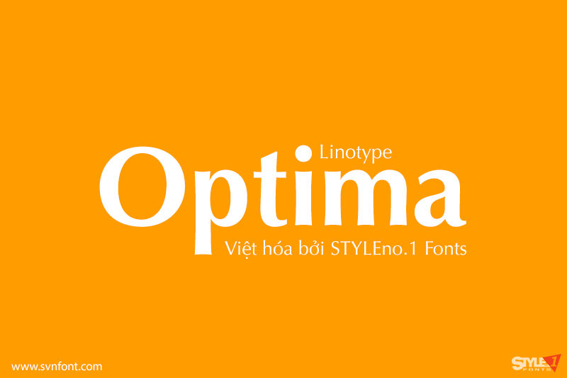
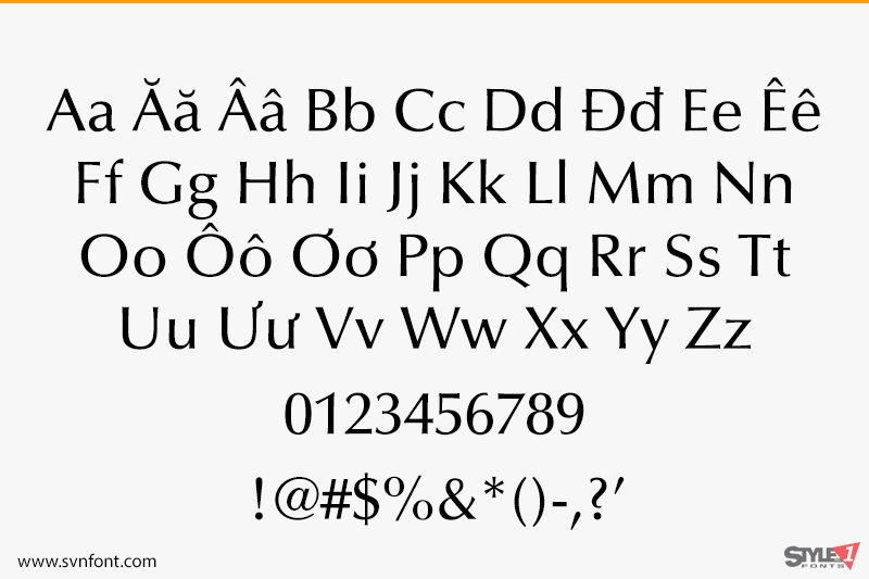
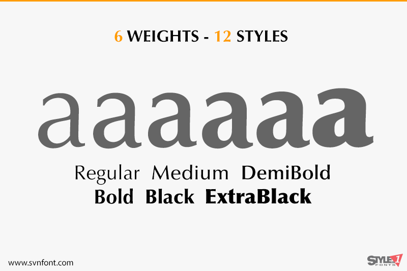
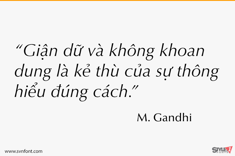
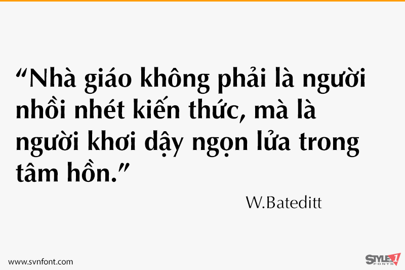
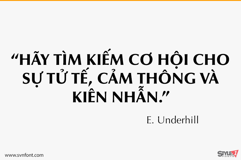
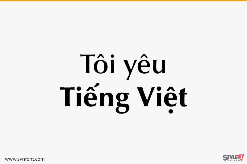
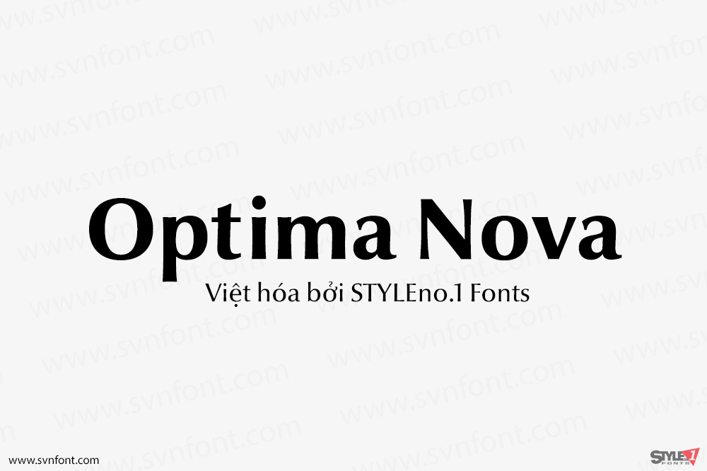
Many typefaces are distinctive or attractive at the expense of legibility and versatility. Not so the Optima® family. Simultaneously standing out and fitting in, there are few projects or imaging environments outside of its range. Although Optima is almost always grouped with sans serif typefaces, it should be considered a serifless roman. True to its Roman heritage, Optima has wide, full-bodied characters – especially in the capitals. Only the E, F and L deviate with narrow forms. Consistent with other Zapf designs, the cap S in Optima appears slightly top-heavy with a slight tilt to the right. The M is splayed, and the N, like a serif design, has light vertical strokes. The lowercase a and g in Optima are high-legibility two-storied designs.
Nhà thiết kế: Hermann Zapf
Nhà phát hành: Linotype
Việt hóa: STYLEno.1 Fonts
Mua bản gốc trước khi sử dụng từ Myfonts
bản Việt hóa cung cấp cho mục đích sử dụng cá nhân dưới hình thức trả phí.
