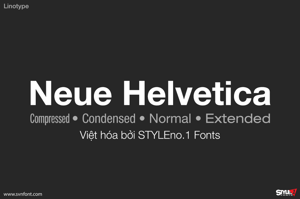
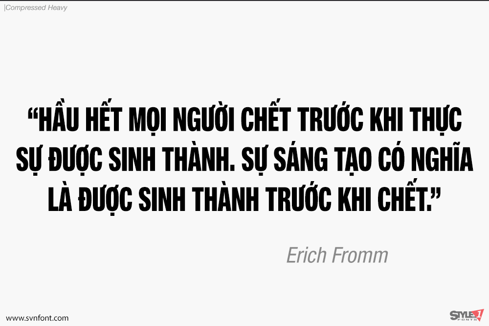
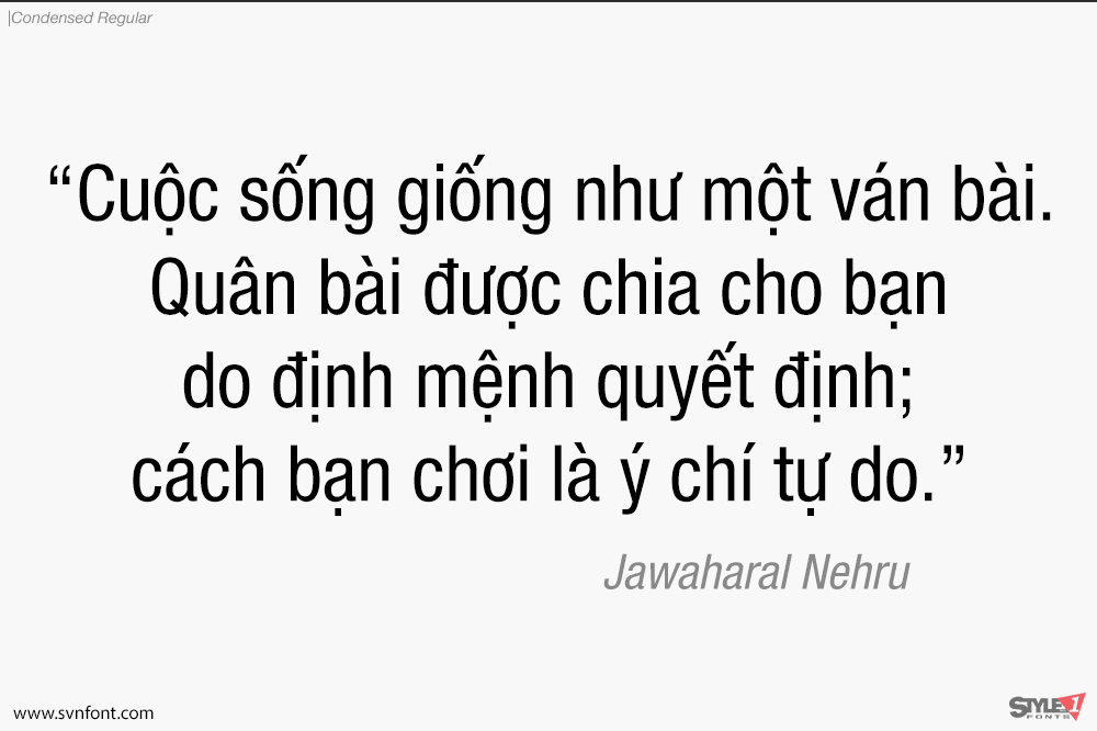
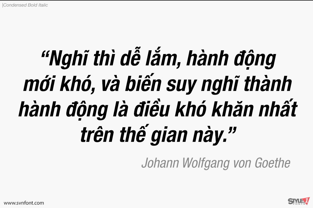
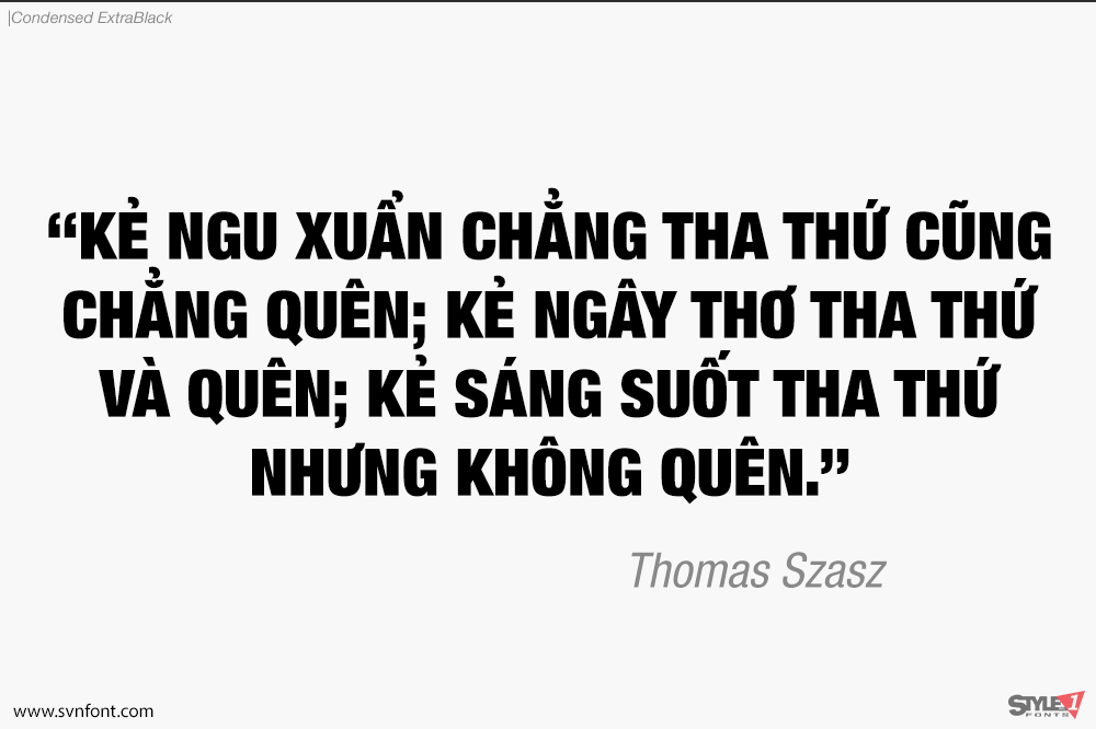
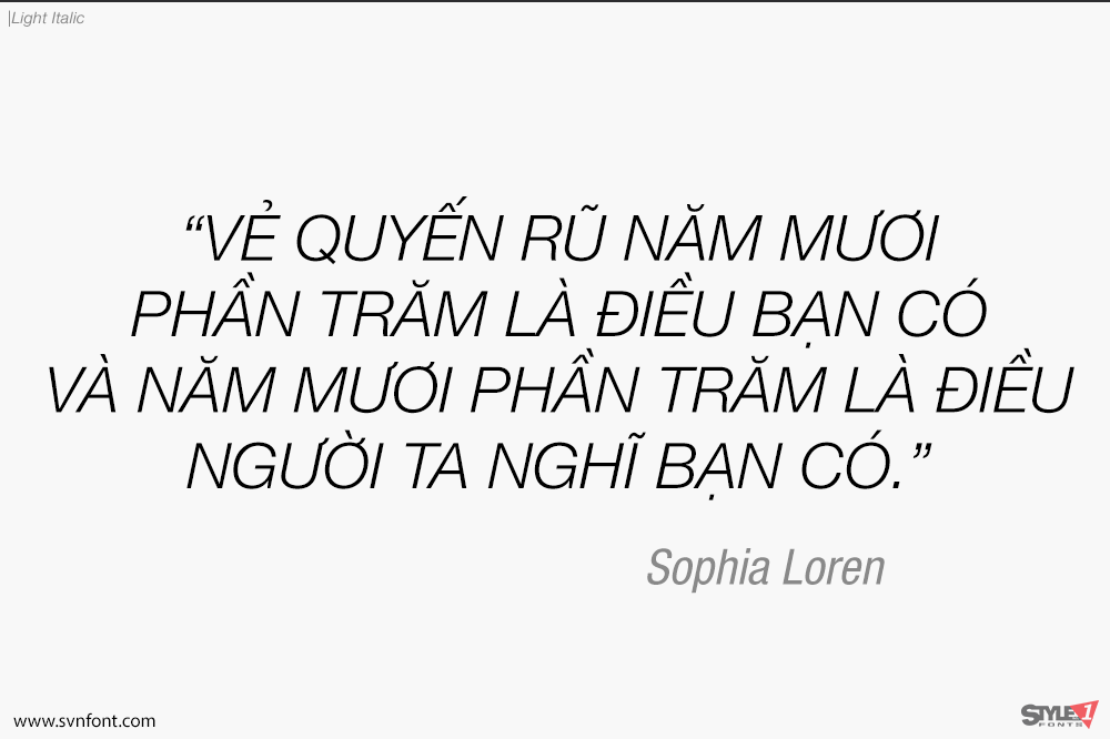
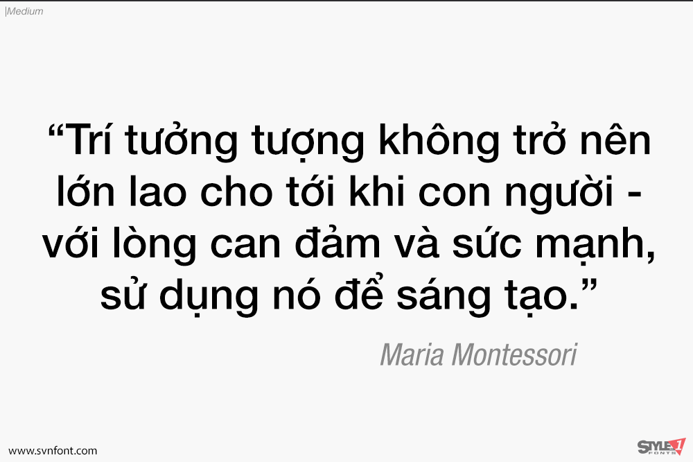
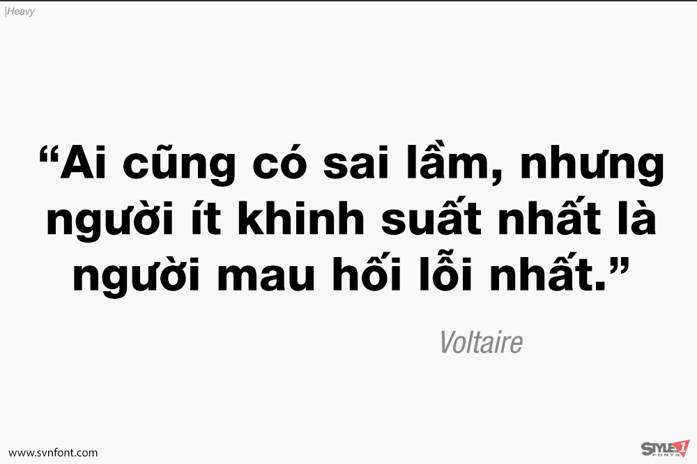
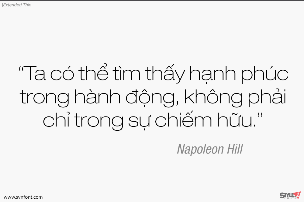
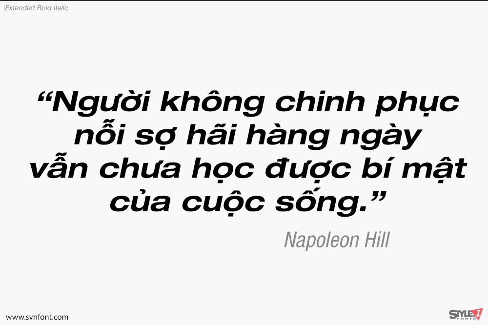
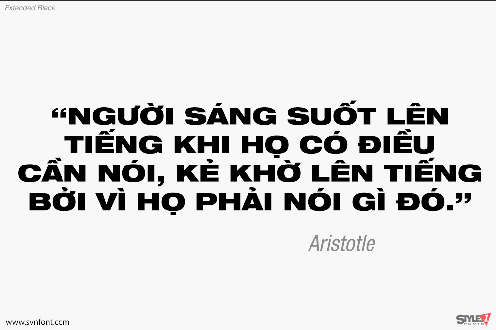
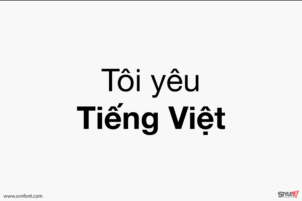
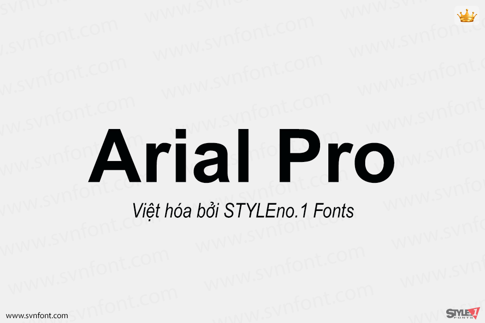
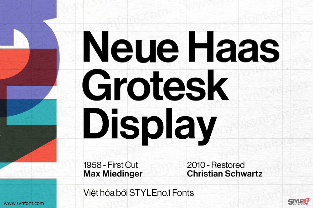
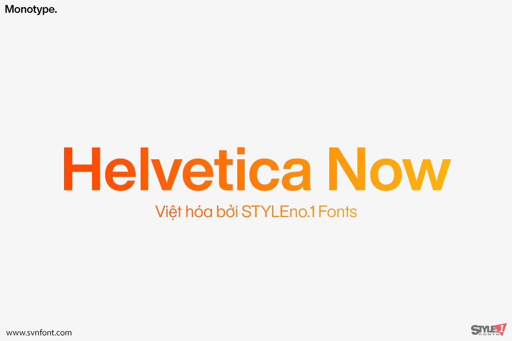
This typeface, designed by Max Miedinger and other project members at the Haas’sche Schriftgiesserei, has become one of the most famous and popular typefaces in the world, thanks to the marketing strategy of Stempel and Linotype. It forms an integral part of many printers and operating systems. The original letterforms of Helvetica had to be modified for the Linotype system. Over the years, Helvetica was expanded to include many different weights, but these were not coordinated with each other.
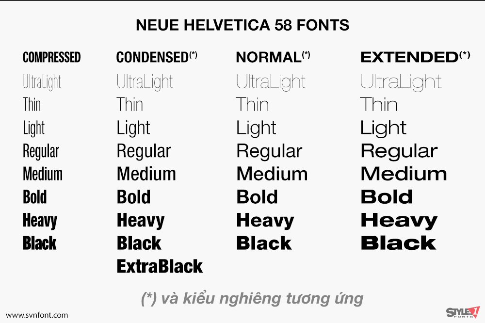
In 1983, D. Stempel AG redesigned and digitized the “Neue Helvetica” typeface for Linotype and made it a self-contained font family. Today, this family consists of 51 different font weights.
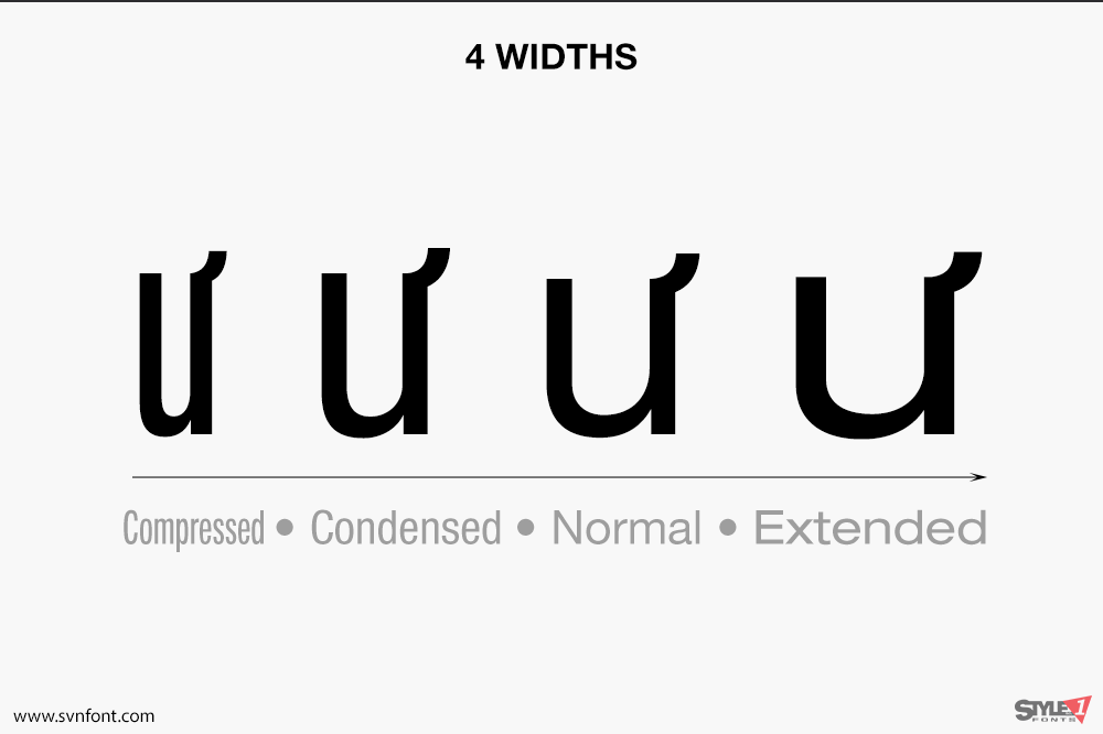
The original numbering system for the weight designations came from the numbering of the Univers font. The basic font weight, “Helvetica roman”, is at the heart of this numbering system. The designation “55 roman” forms the central point. The first figure of the number describes the stroke thickness: 25 ultra light to 95 extra black. The second figure gives information on the width and orientation of the font: Helvetica 53 extended to Helvetica 57 condensed.
The Neue Helvetica sets new standards in terms of its form and number of variants. It is the quintessential sans serif font, timeless and neutral, and can be used for all types of communication.
Nhà thiết kế: Max Miedinger, Edouard Hoffmann
Nhà phát hành: Linotype
Việt hóa: STYLEno.1 Fonts
Mua bản gốc trước khi sử dụng từ Myfonts
Bản Việt hóa cung cấp cho mục đích sử dụng cá nhân dưới hình thức trả phí.
👉 Xem thêm: SVN-Helvetica Now (72 fonts)

