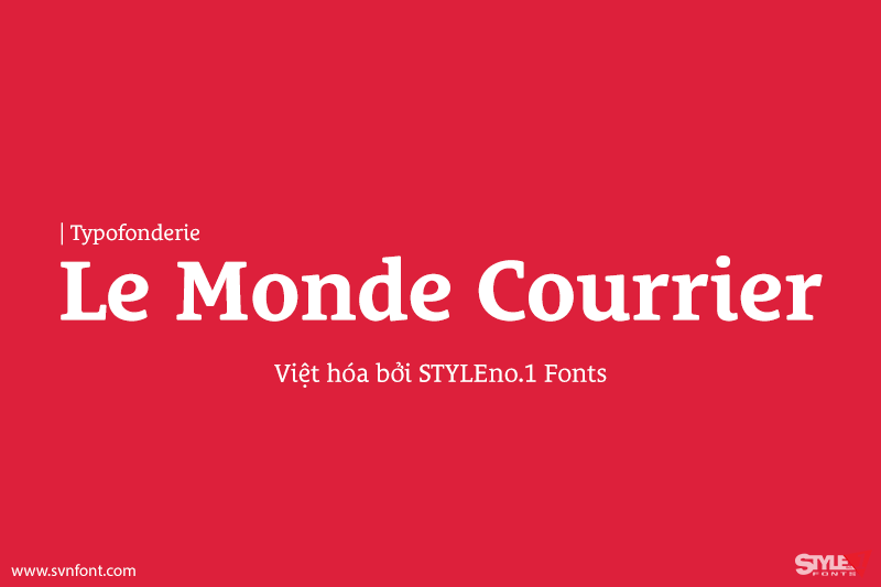
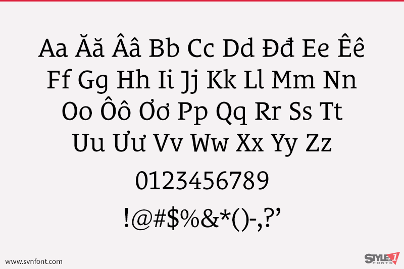
In our age, since the arrival of microcomputing, the majority of professional letters have been composed in quality typefaces. Typewriters & the typestyles they used have become antiques. A letter set in Times or Helvetica & printed with a laser printer at 600 dpi or more are of such quality that one can no longer distinguish it with a document produced by offset printing. But letters composed in this way appear overly institutional when a bit of informality is needed. Le Monde Courrier, designed by Jean François Porchez, attempts to re-establish a style halfway between writing and printing.
Nhà thiết kế: Jean François Porchez
Nhà phát hành: Typofonderie
Việt hóa: STYLEno.1 Fonts
Mua bản gốc trước khi sử dụng từ Typofonderie
Bbản Việt hóa cung cấp cho mục đích sử dụng cá nhân dưới hình thức trả phí