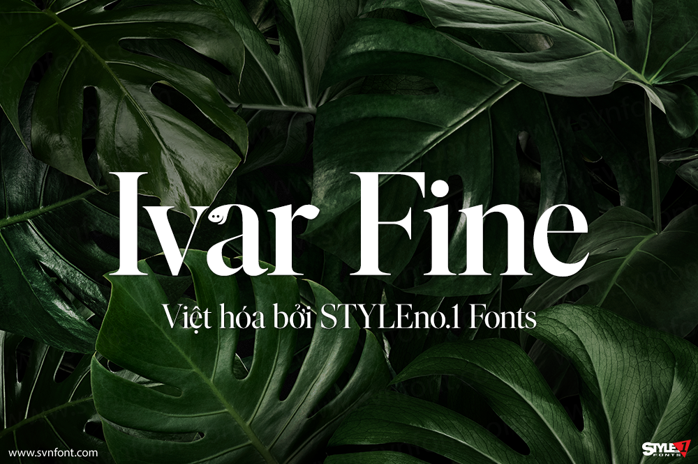
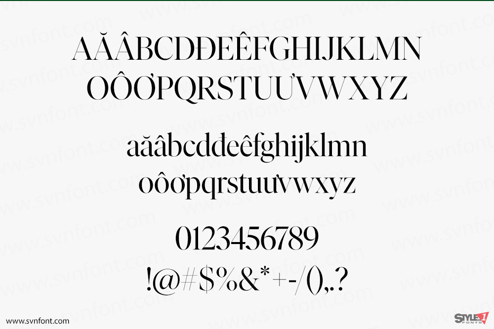
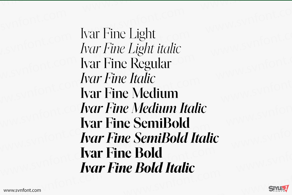
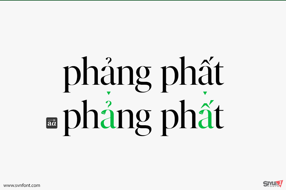
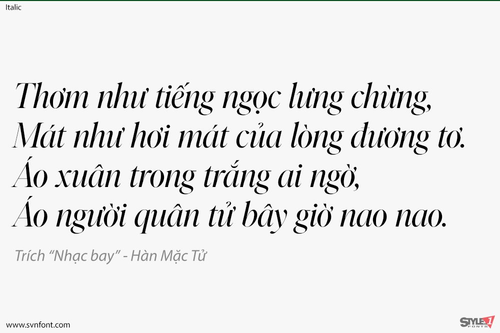
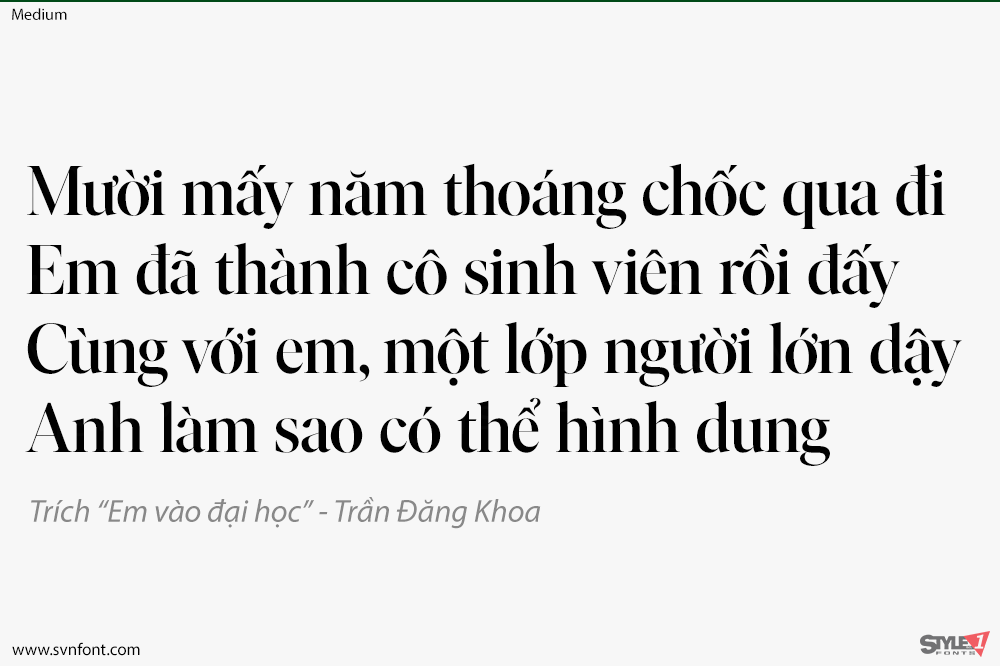
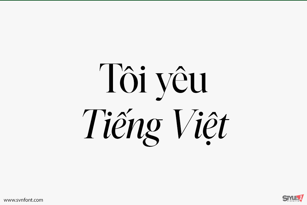
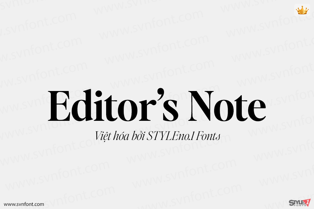
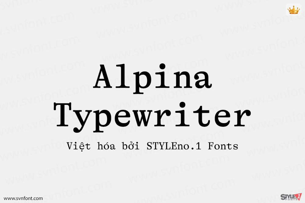
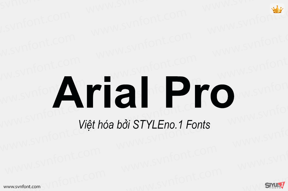
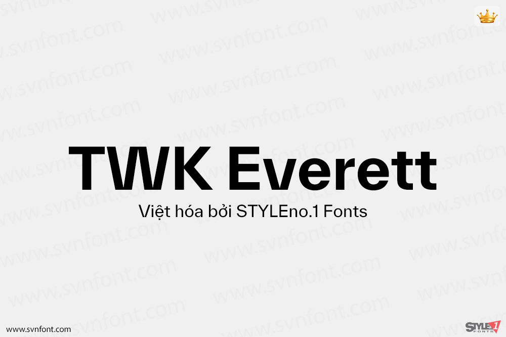
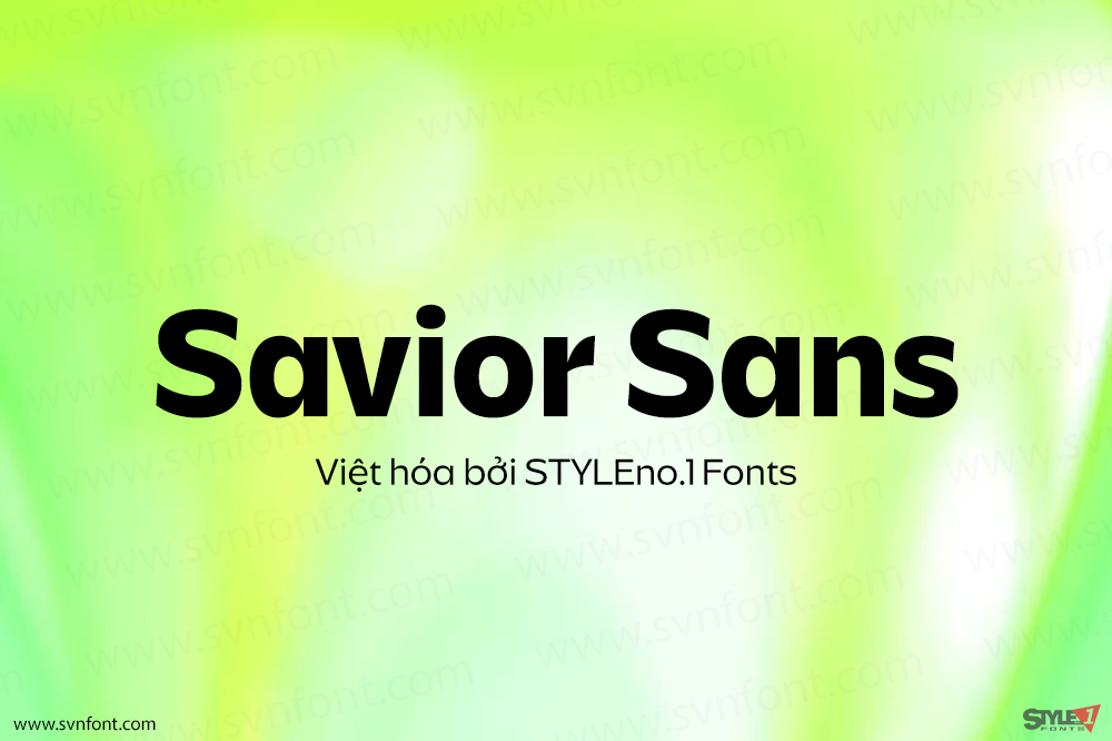
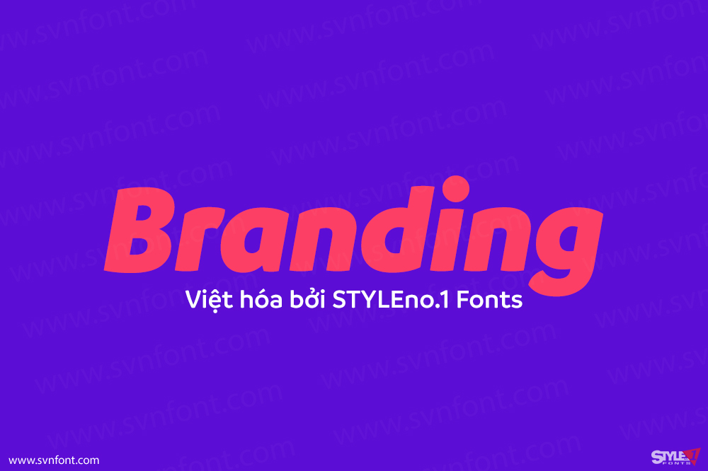
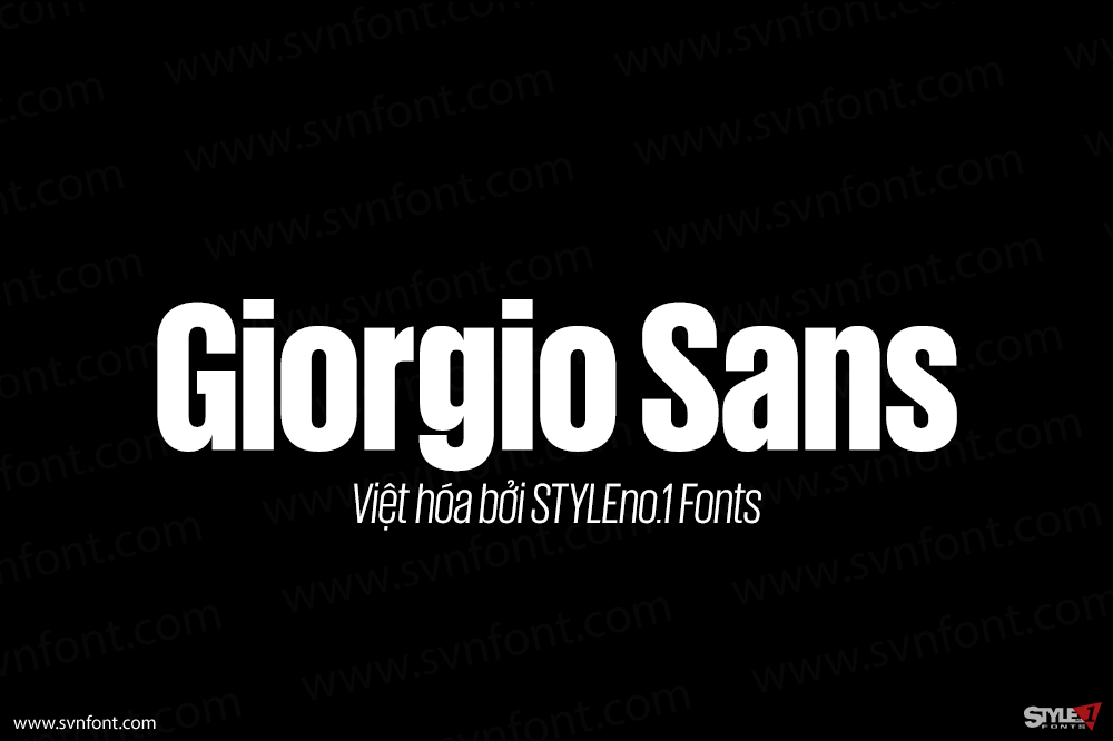
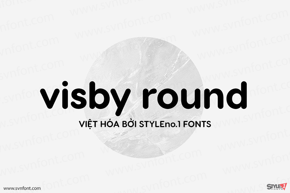
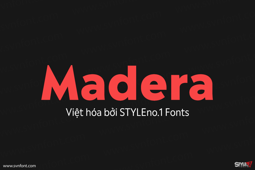
Ivar Fine is the fourth optical size in the Ivar family. Ivar Fine uses even higher contrast than Ivar Display to achieve elegance and sharpness. Comes in 5 weights with Italics.
Ivar began with the idea of creating a serif companion for Siri. During its development, it became apparent that typographic siblings don’t necessarily need to have a uniform design. After three years of drawing and perfecting the letterforms, the only shared characteristics that remain are the shapes of the terminals.
Rather than being a revival, Ivar is strongly influenced by the grace and sturdy construction of Times. The typeface stands on the shoulders of giants: the design refers to the dependable text faces from the mid-1900s, which in turn were rooted in classic designs from the 16th and 17th century.
Nhà thiết kế: Göran Söderström
Nhà phát hành: Letters from Sweden
Việt hóa: STYLEno.1 Fonts
Mua bản gốc nếu sử dụng cho mục đích thương mại từ lettersfromsweden.se
Bản Việt hóa cung cấp cho mục đích sử dụng cá nhân dưới hình thức trả phí.

