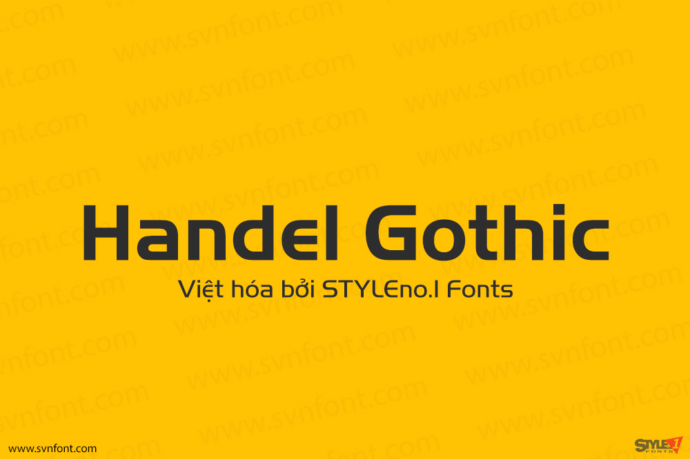
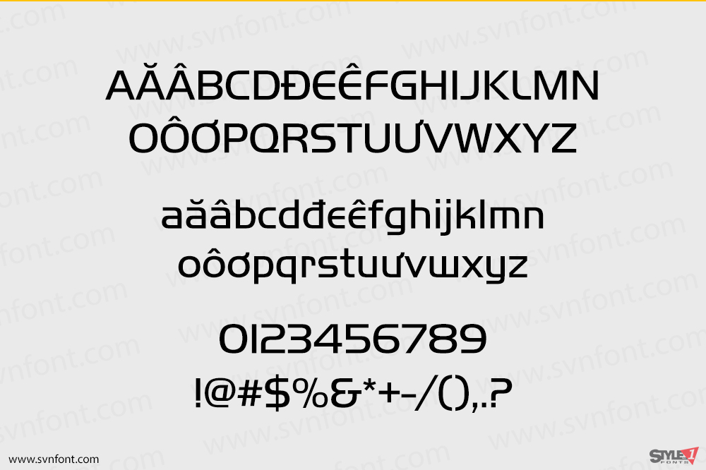
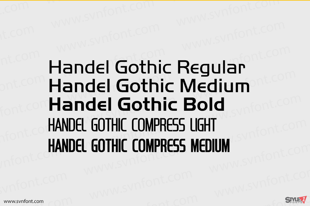
The Handel Gothic? typeface has been a mainstay of graphic communication for over 40 years – all the while looking as current as tomorrow. Designed by Don Handel in the mid-1960s, and used in the 1973 United Airlines logo developed by Saul Bass, Handel Gothic was an instant success when released to the graphic design community. Its generous lowercase x-height, full-bodied counters and square proportions make the design highly readable at a wide range of sizes. Handel Gothic’s slightly idiosyncratic character shapes gave the face a futuristic look 40 years ago that retains its power today. In addition, its Uncial-like lowercase is instantly identifiable – and unique among sans serif typestyles.
Nhà thiết kế: Phil Martin, Don Mandel
Nhà phát hành: URW Type Foundry
Việt hóa: STYLEno.1 Fonts
Mua bản gốc nếu sử dụng mục đích thương mại từ Myfonts
Bản Việt hóa cung cấp cho mục đích sử dụng cá nhân dưới hình thức trả phí.
