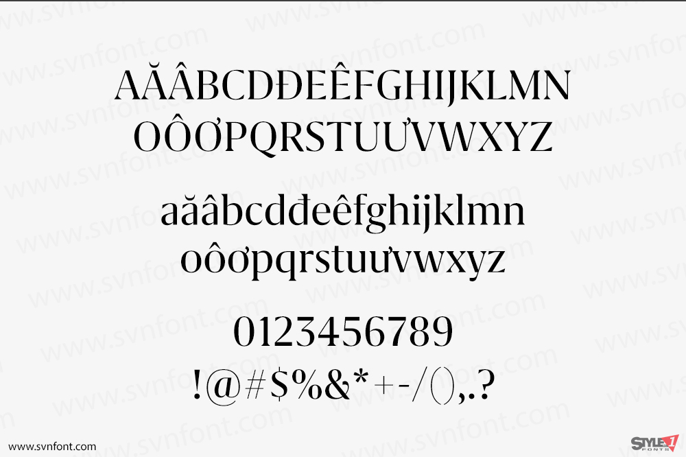
Grifo’s design draws on the extreme hight stroke contrast of the neoclassic types but has bracketed serifs and sharp triangular terminals. Indeed, sharp spikes and hooks are one of grifo’s traits, specially in the L size. It’s full of talon shapes, like the c, e, the bottom curve of the t, or most obviously, commas and quotes. One other distinguishing quality is the prominently rational approach of the shapes, with very hard lines, as if the letters were cut with a scalpel. Vertical strokes all end with abrupt horizontal cuts and the baseline serifs of the letters a, d and u where cut off, to give the alphabet a harder and simplified edge, contributing also to save space.
Nhà thiết kế: Rui Abreu
Nhà phát hành: R-Typography
Việt hóa: STYLEno.1 Fonts
Mua bản gốc nếu sử dụng cho mục đích thương mại từ R-Typography
Bản Việt hóa cung cấp cho mục đích sử dụng cá nhân dưới hình thức trả phí.

![]()