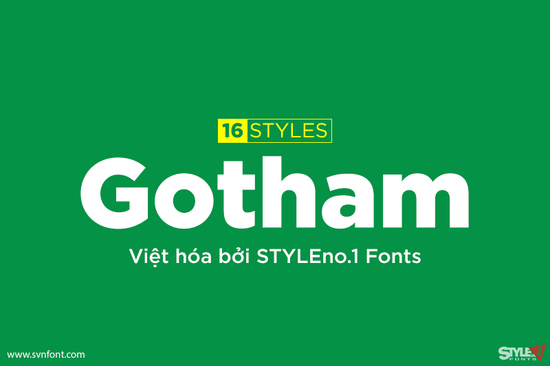
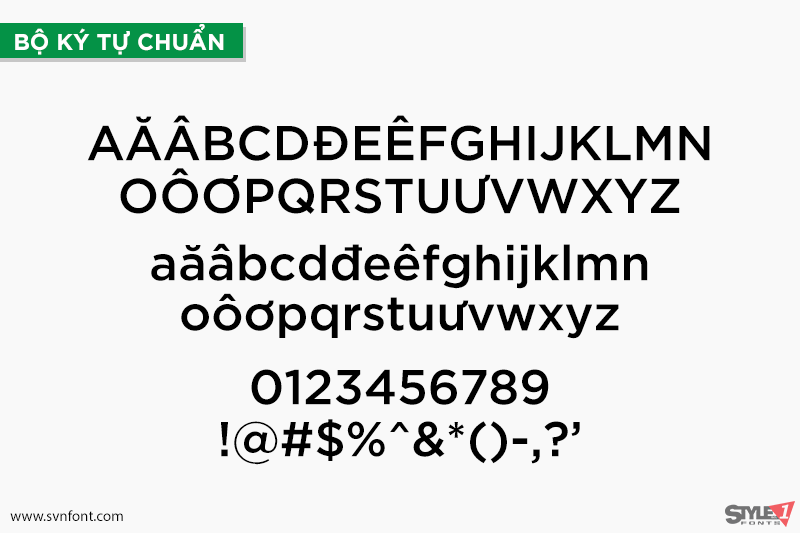
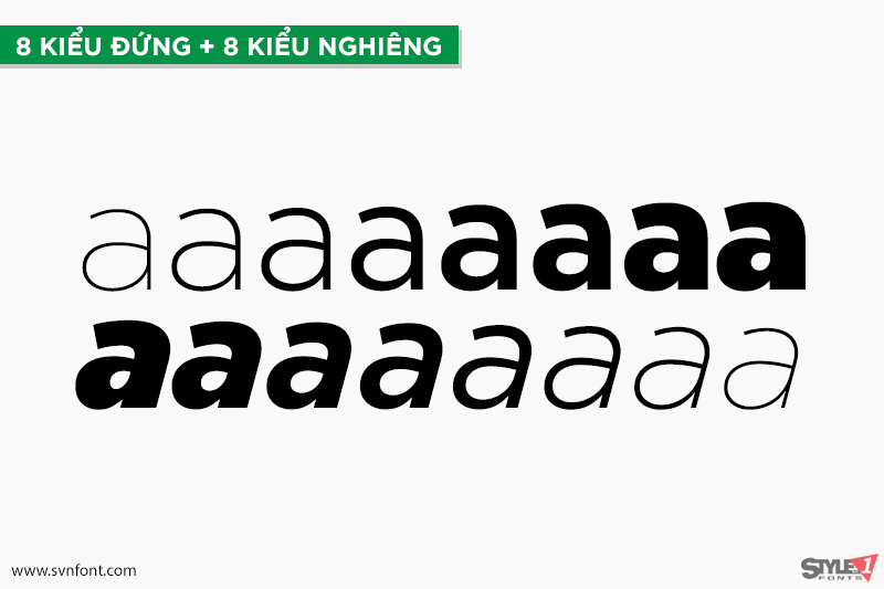
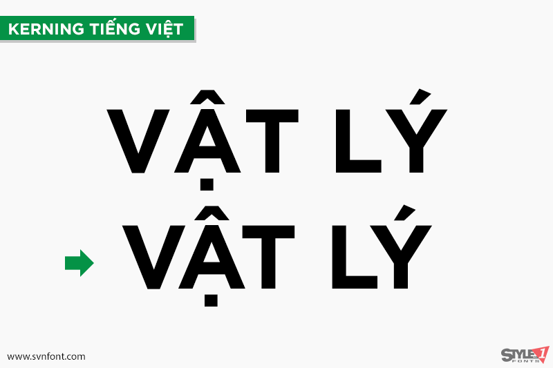
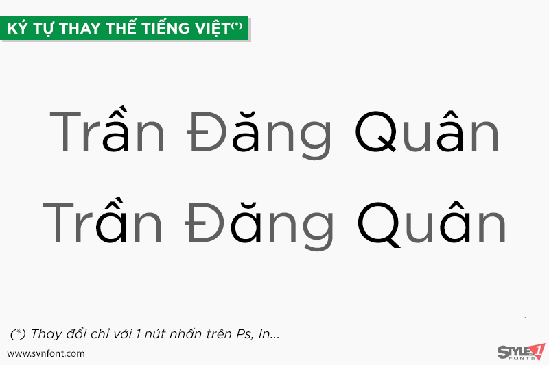
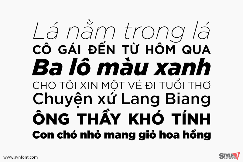
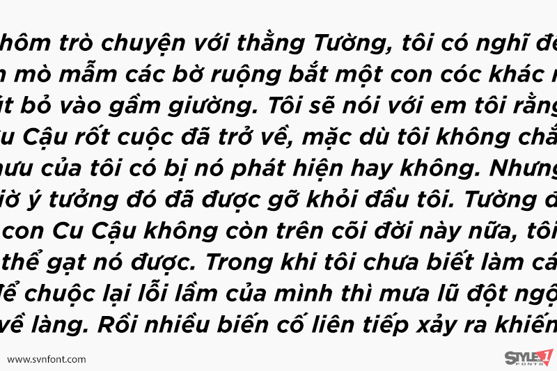
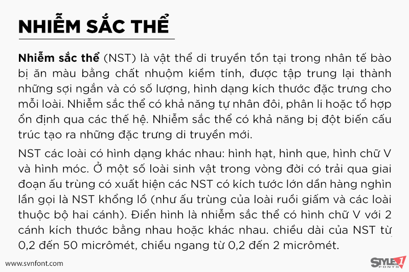
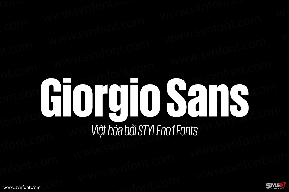
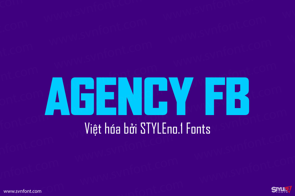
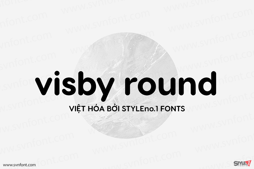
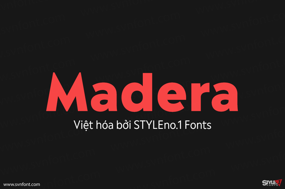
Gotham celebrates the attractive and unassuming lettering of the city. New York is teeming with such letters, handmade sans serifs that share a common underlying structure, an engineer’s idea of “basic lettering” that transcends both the characteristics of their materials and the mannerisms of their makers. These are the cast bronze numbers that give office doorways their authority, and the markings on cornerstones whose neutral and equable style defies the passage of time. They’re the matter-of-fact neon signs that emblazon liquor stores and pharmacies, and the names of proprietors plainly painted on delivery trucks. These letters are straightforward and non-negotiable, yet possessed of great personality, and often expertly made. And although designers have lived with them for more than half a century, they remarkably went unrevived until 2000, when we introduced Gotham…
Gotham family được bán trên Typography.com
Phiên bản Việt hóa cung cấp cho mục đích sử dụng cá nhân.
Hãy mua bản quyền từ tác giả trước khi sử dụng.
