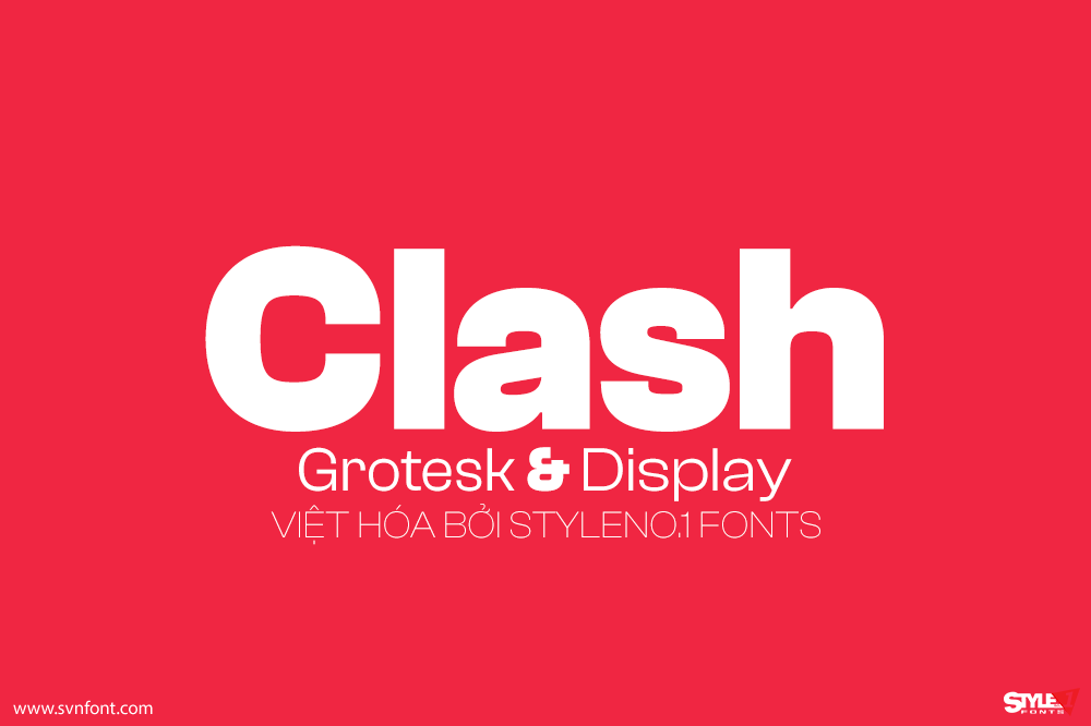
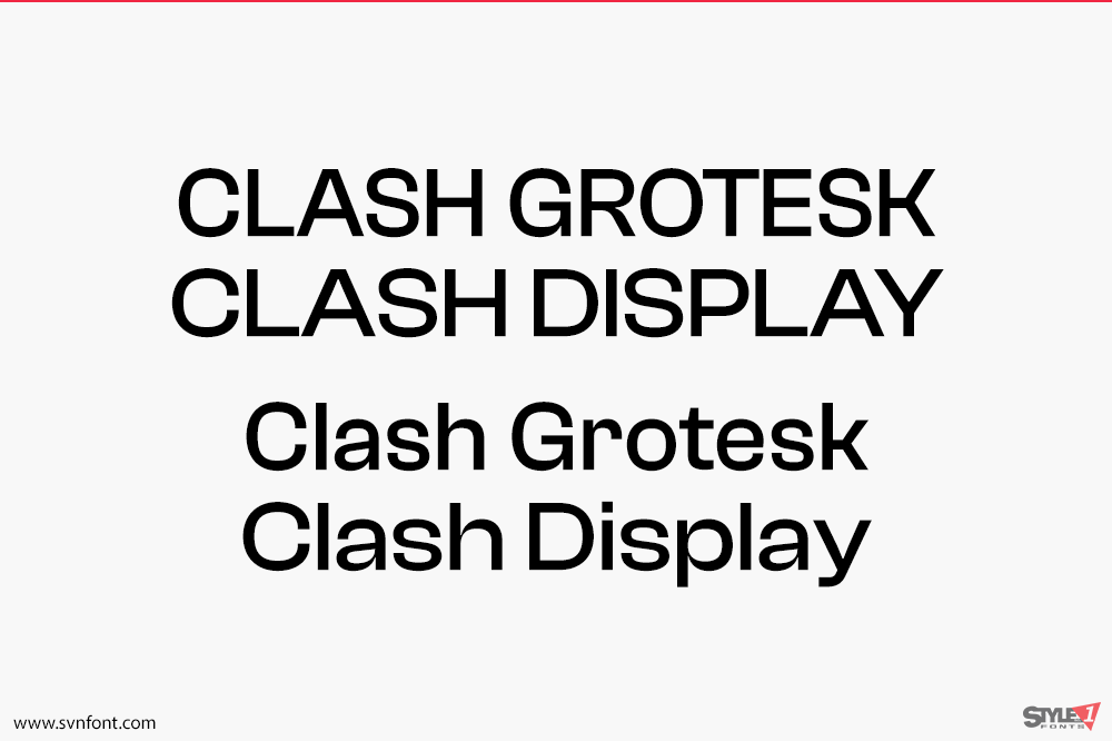
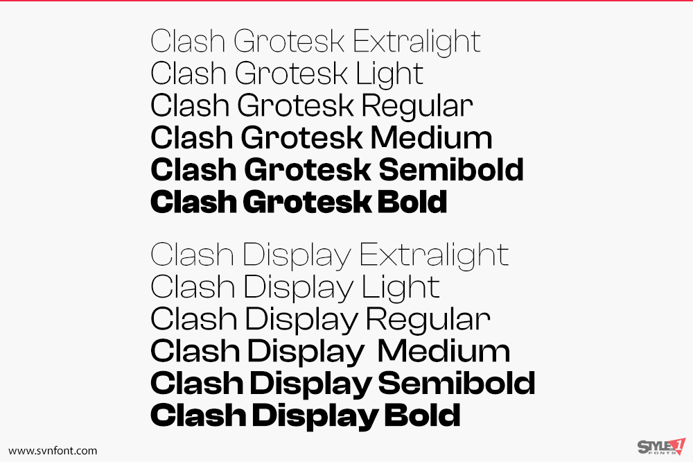
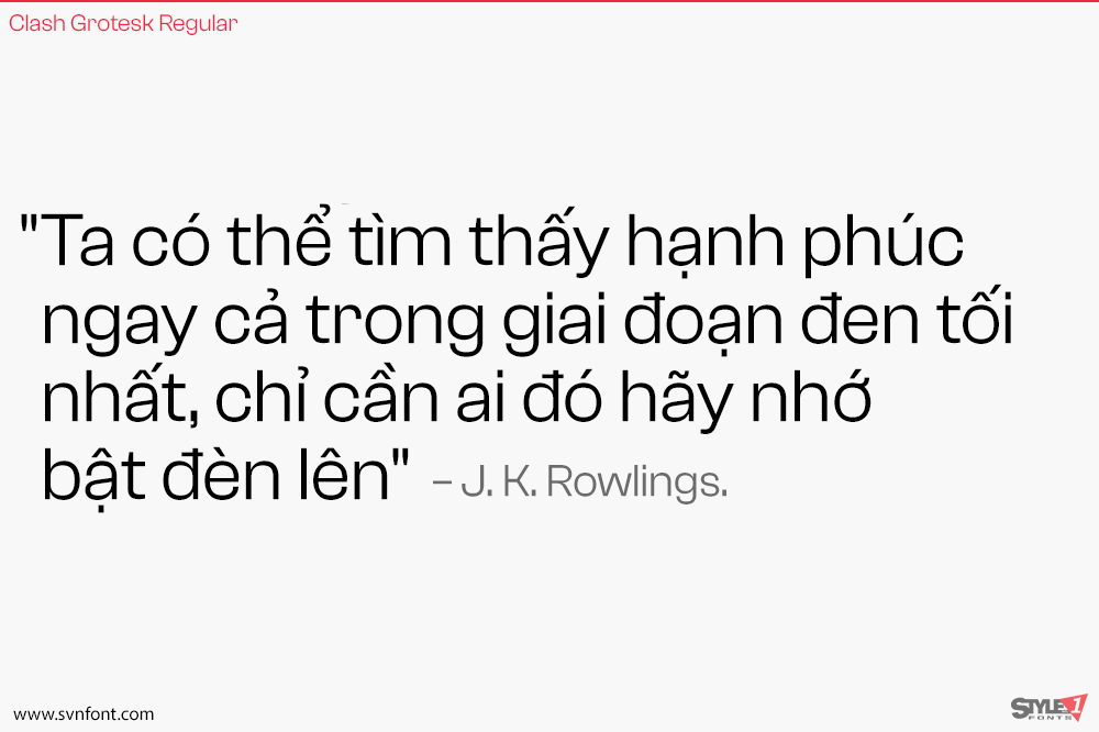
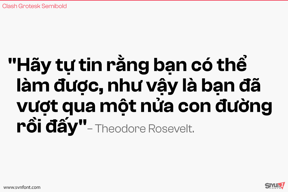
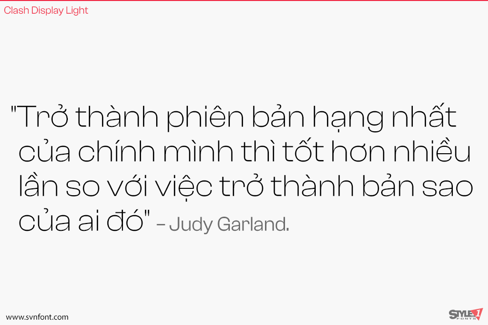
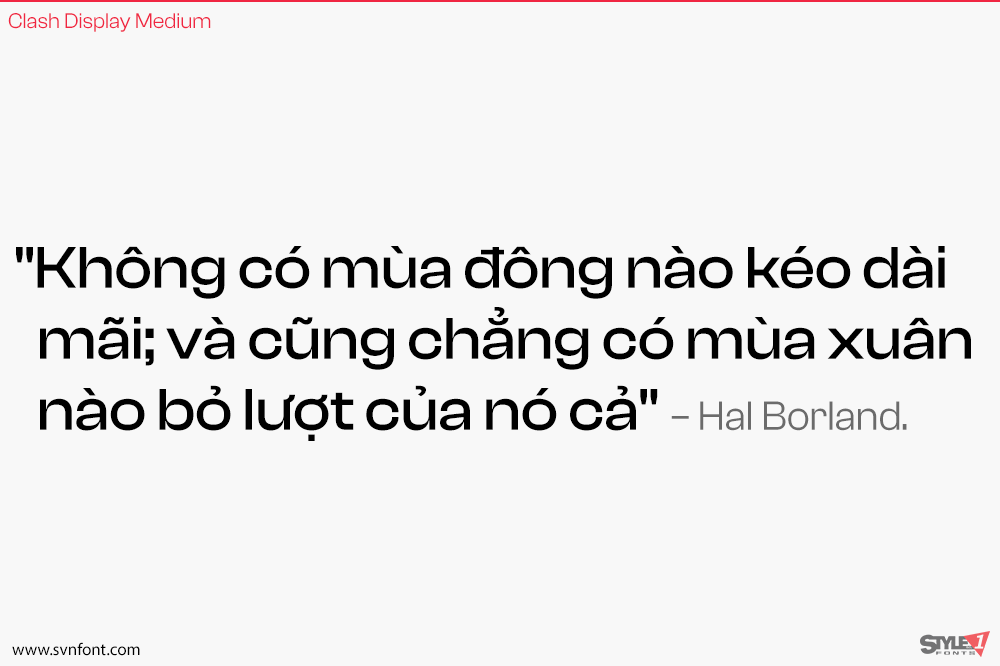
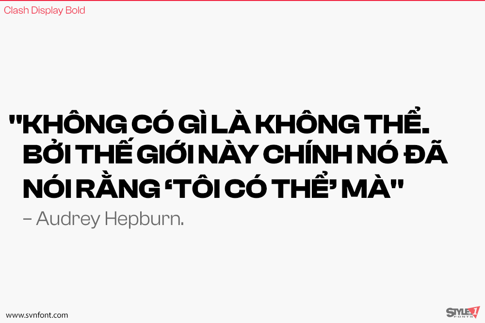
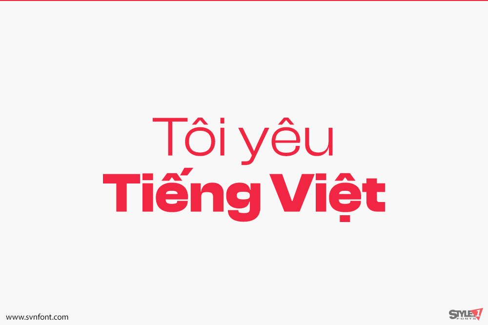
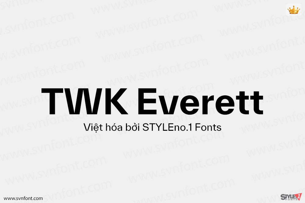
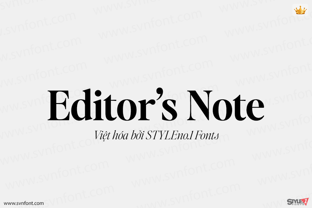
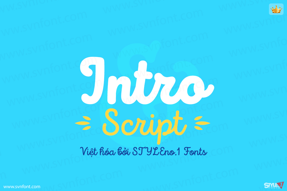
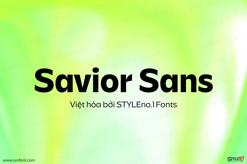
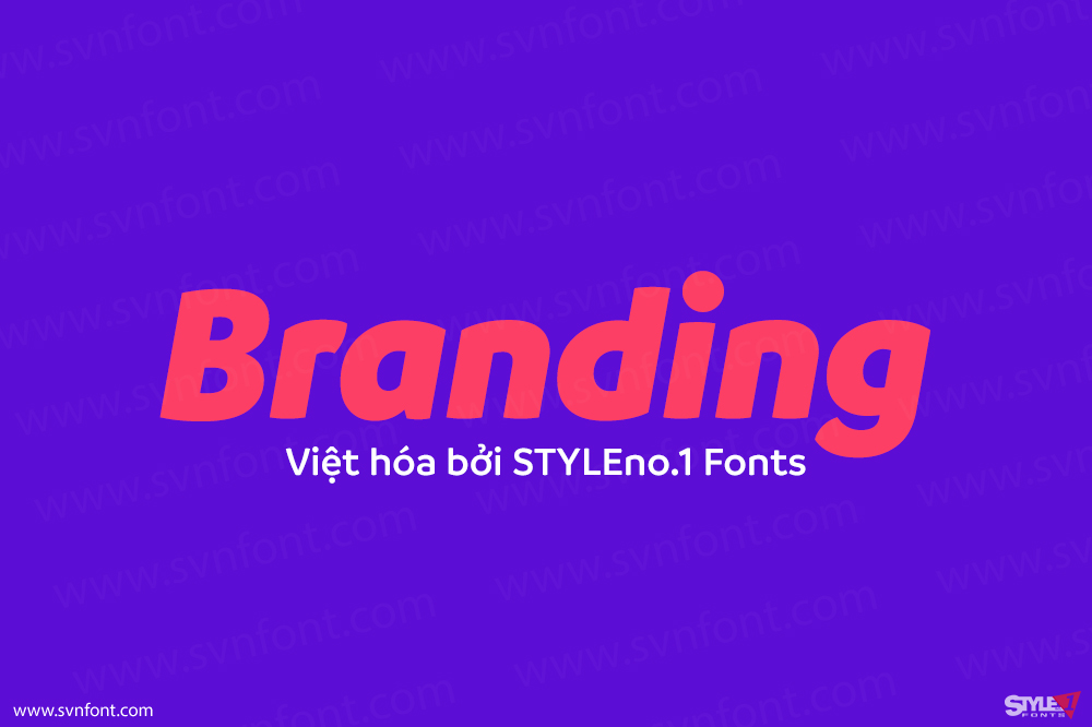
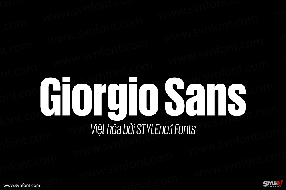
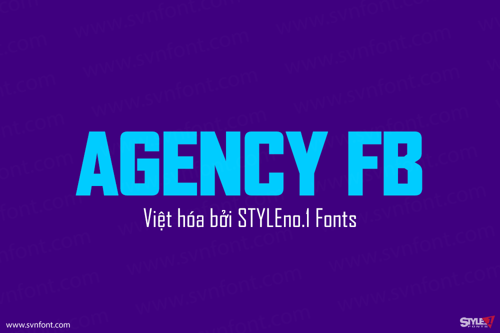
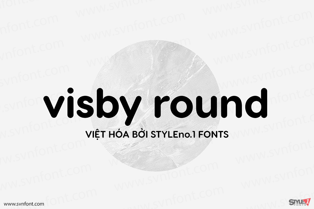
Clash Grotesk Display is a family of sans serif fonts for use in large sizes. While the design of the family’s six styles – ranging in weight from Extralight through Bold – is generally neo-grotesk in style, one feature immediately sets them apart from other typefaces of that genre: The letterforms have very small ‘apertures’. These are the openings at the edges of counterforms; if you look at the ‘c’, for instance, the space between ends of the arms on the letter’s right-hand side is very small. It almost looks like that aperture is about to close shut. Clash Grotesk Display is eye catching, but its ‘design trick’ does not go overboard. The typeface is tame enough to be used in corporate identity work, while remaining exciting enough for editorial designers.
Clash Grotesk is a family of sans serif fonts, with a twist. While the design of the family’s six styles is generally neo-grotesk in style, one feature immediately sets it from other typefaces in that genre: Its letterforms have very small ‘apertures’. These are the openings at the edges of the counterforms; if you look at the letter ‘c’, for instance, the space between ends of the two arms on the right-hand side of the letter is very small. It almost looks as if that aperture is about to close shut. Clash Grotesk is eye catching, but its ‘design trick’ does not go overboard. The typeface is tame enough to be used in corporate identity work, while remaining exciting enough for editorial designers.
Nhà thiết kế: Indian Type Foundry
Nhà phát hành: Indian Type Foundry
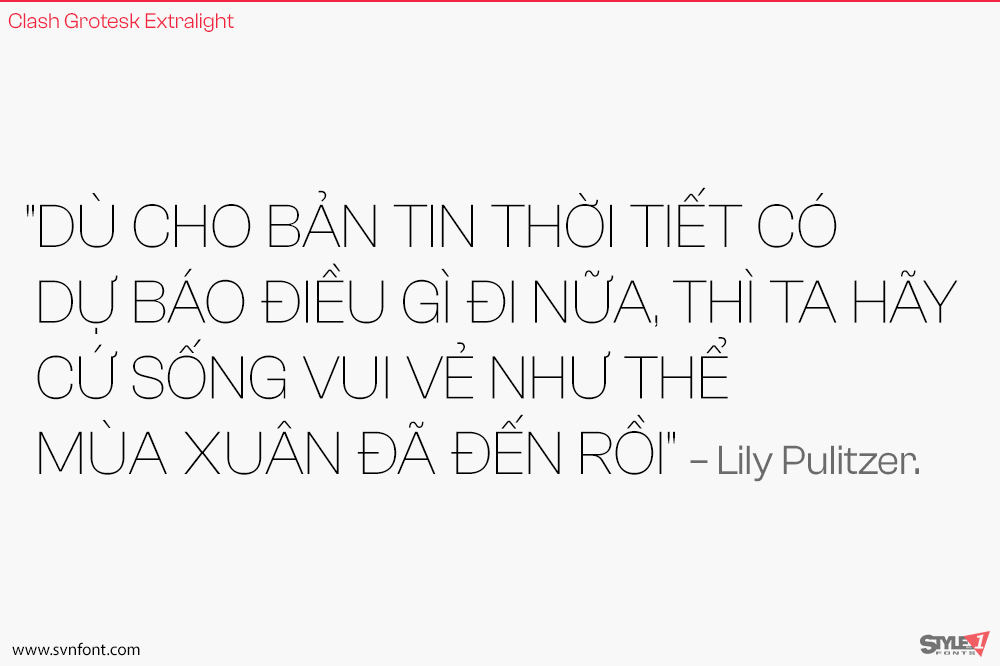
Việt hóa: STYLEno.1 Fonts
Bản gốc miễn phí cho mọi mục đích sử dụng và được cung cấp qua Fontshare.com
Bản Việt hóa cung cấp cho mọi mục đích sử dụng dưới hình thức trả phí.

