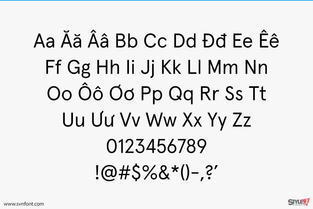
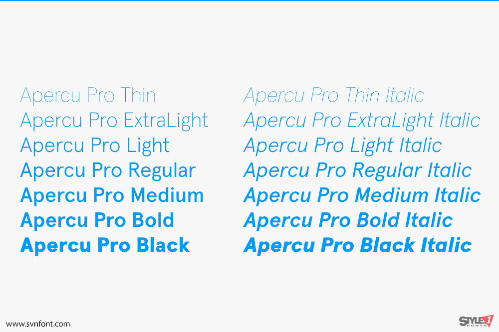
Aperçu was started in December 2009, and was trialled & tested throughout a number of design commissions.. The conceit behind Aperçu was to create a synopsis or amalgamation of classic realist typefaces: Johnston, Gill Sans, Neuzeit & Franklin Gothic. Becoming, a sum of parts, building upon its initial reference points to create an extensive and usable family. Since its release in August 2010, Aperçu quickly found its position in the market, being used across a variety of different media and sectors around the world across a multitude of touchpoints. Utilised by leading visual institutions such as MOMA,Burberry, De Wiels, Zeit Magazine and the Walker Art Centre amongst many others…
Nhà thiết kế: Colophon Foundry
Nhà phát hành: Colophon Foundry
Việt hóa: STYLEno.1 Fonts
Mua bản gốc trước khi sử dụng từ Colophon Foundry
Bản Việt hóa cung cấp cho mục đích sử dụng cá nhân dưới hình thức trả phí.


