HomeSlab
Slab
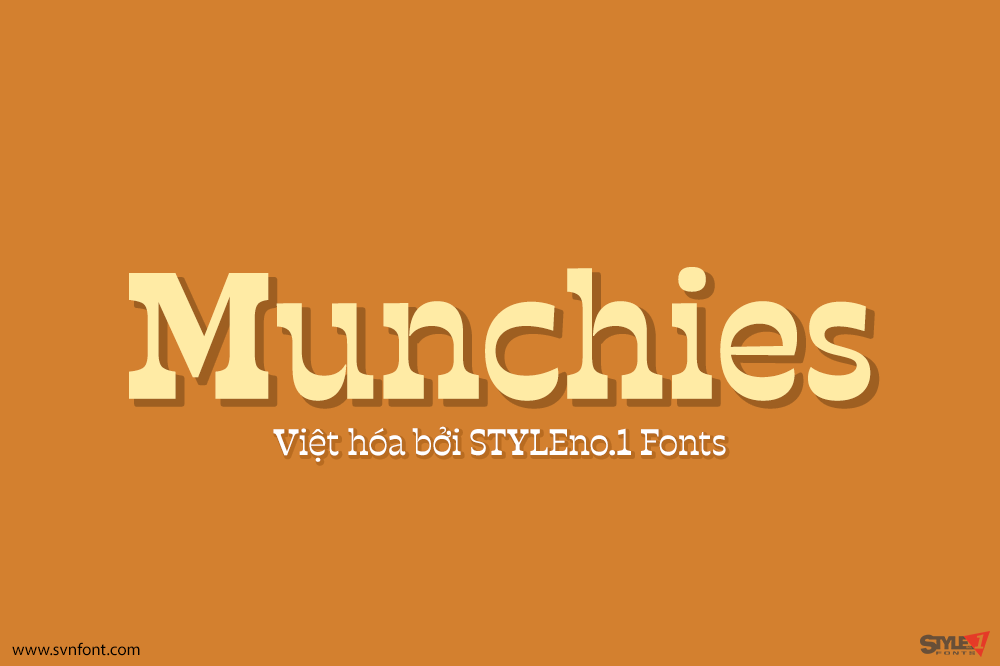
[Trả phí] SVN-Munchies (6 fonts) – Việt hóa
Munchies is a reverse contrast slab-serif font family. Inspired by the volume and size of 19th century wood letterpress blocks and the Italian Caslon language....
Đọc tiếp...
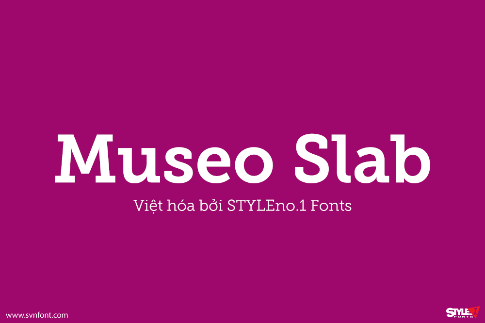
[Trả phí]SVN-Museo Slab (12 fonts) – Việt hóa
Museo Slab is a robust slab serif with Museo's friendliness. It is a perfect match for Museo Sans. Designers: Jos Buivenga Publisher: exljbris Việt hóa: STYLEno.1 Fonts...
Đọc tiếp...
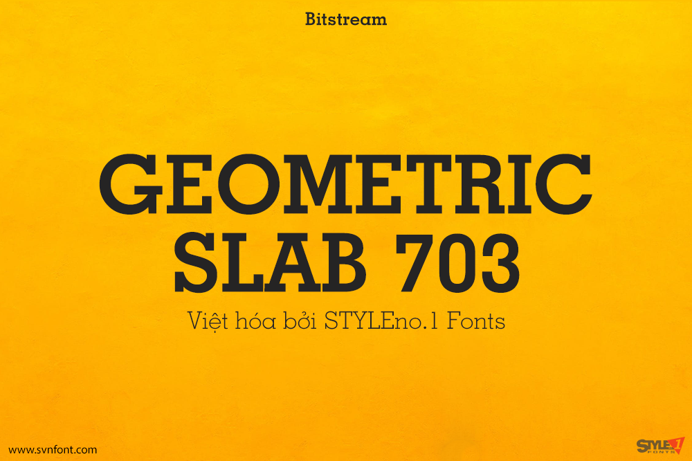
[Trả phí] SVN-Geometric Slab 703 (11 fonts) – Việt hóa
Geometric Slabserif 703 was designed by Rudolf Wolf and published by Bitstream. Geometric Slabserif 703 contains 11 styles and family package options. Nhà thiết kế:...
Đọc tiếp...
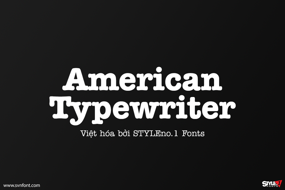
[Trả phí] SVN-American Typewriter (9 fonts) – Việt hóa
ITC American Typewriter was designed by Joel Kaden and Tony Stan. It is an ode to the invention that shaped reading habits and the idea...
Đọc tiếp...
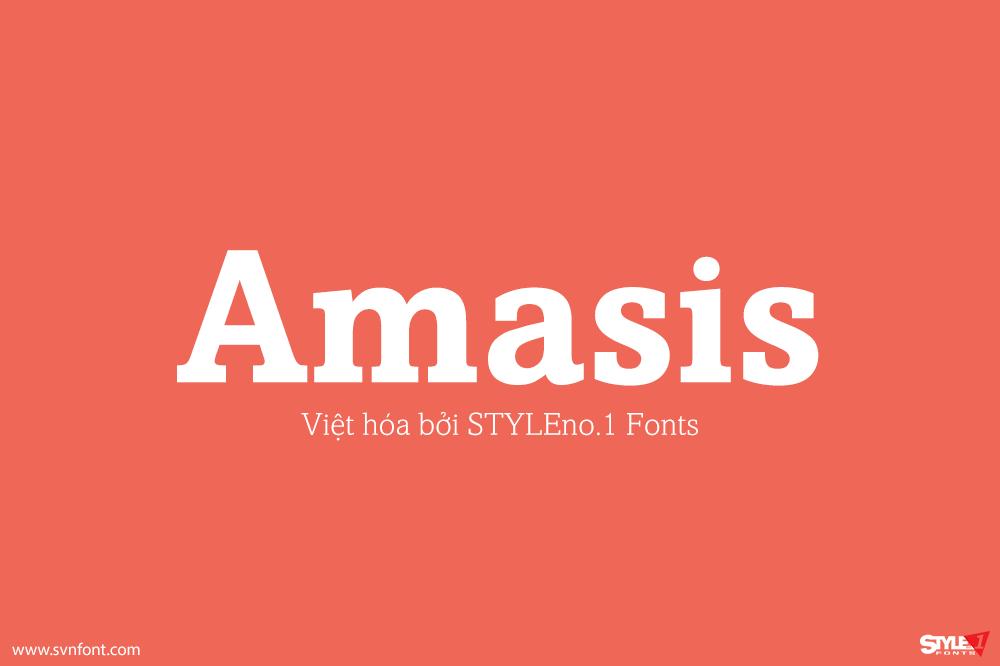
[Trả phí] SVN-Amasis (10 fonts) – Việt hóa
The Amasis™ font family is a slab serif design, rendered with a humanist influence by the noted British graphic artist and type designer Ron Carpenter....
Đọc tiếp...
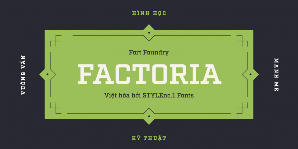
[Trả phí] SVN-Factoria (16 fonts) – Việt hóa
Born out of Industry, Factoria is a geometric, square slab. The hard-working family can jump from the side of an industrial building and into a...
Đọc tiếp...
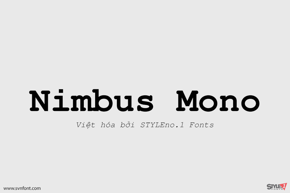
[Trả phí] SVN-Nimbus Mono (4 fonts) – Việt hóa
Nimbus Mono is a monospaced typeface created by URW Studio in 1984, and eventually released under the GPL and AFPL (as Type 1 font for...
Đọc tiếp...
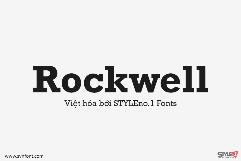
[Trả phí] SVN-Rockwell (9 fonts) – Việt hóa
Whether you call them slab serif, square serif, or Egyptian, you know them when you see them – sturdy, nearly monoweight designs with blunt, straight-edged...
Đọc tiếp...
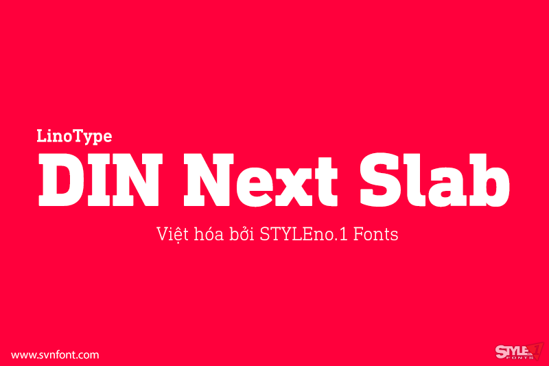
[Trả phí] SVN-DIN Next Slab (14 fonts) – Việt hóa
Now comes the next step, DIN Next Slab, also produced under the direction of Akira Kobayashi. On a team with Sandra Winter and Tom Grace,...
Đọc tiếp...
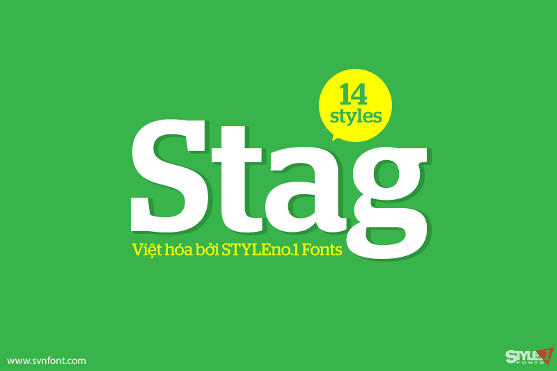
[Trả phí] SVN-Stag (14 fonts) – Việt hóa
Stag is a typeface superfamily published by Commercial Type. It first originated as a slab serif, commissioned by Esquire for their magazine headlines. Since then...
Đọc tiếp...

