HomeSans-serif
Sans-serif
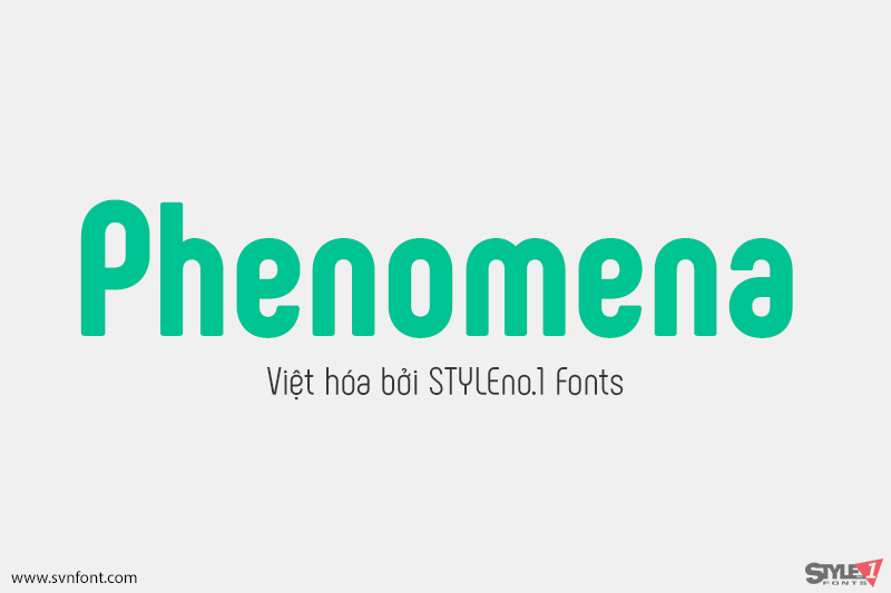
[Trả phí] SVN-Phenomena (7 fonts) – Việt hóa
Phenomena is a modern sans serif font based on round geometric shapes. It has condensed proportions and slight retro feel. The rounded corners soften the overall...
Đọc tiếp...
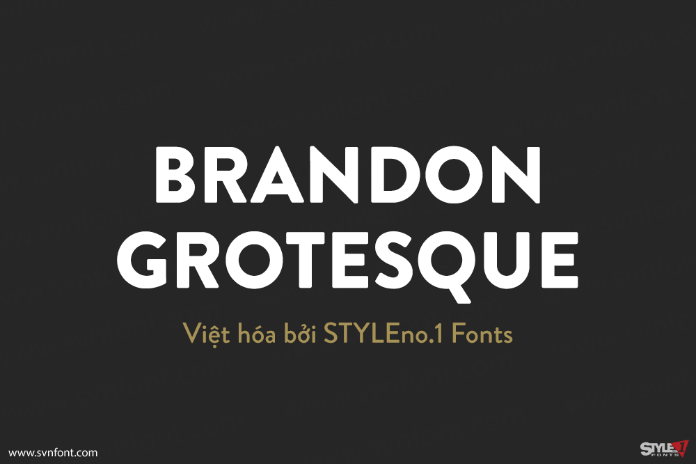
[Trả phí] SVN-Brandon Grotesque (12 fonts) – Việt hóa
Brandon Grotesque is a sans serif type family of six weights plus matching italics. It was designed by Hannes von Döhren in 2009/10. Influenced by...
Đọc tiếp...
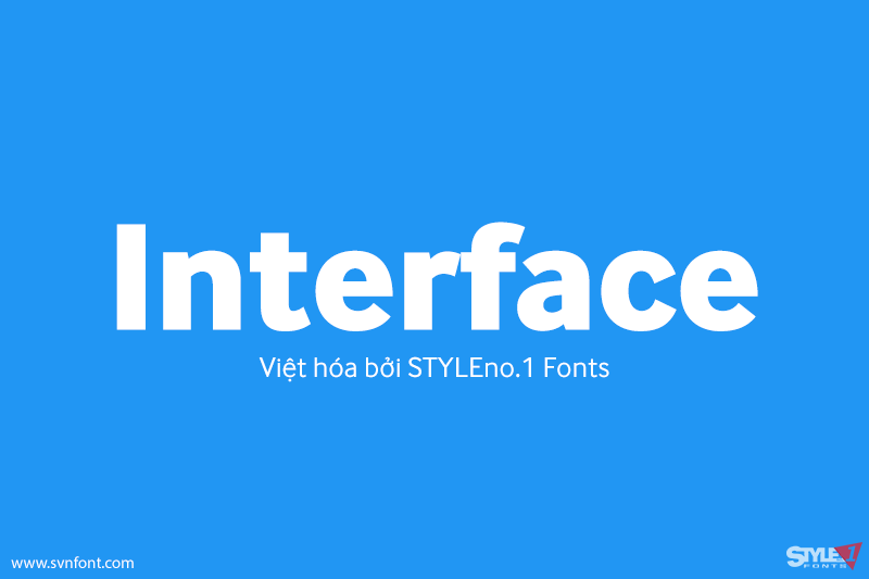
[Trả phí] SVN-Interface (12 fonts) – Việt hóa
The design of InterFace is influenced by the sans serif fonts of the late 19th Century. While many of the features are Grotesque, a softer...
Đọc tiếp...
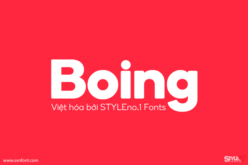
[Trả phí] SVN-Boing (12 fonts) – Việt hóa
Boing is a bold, rounded sans serif font ideal for a range of communication needs. The face is soft, yet solid, determined, yet friendly. Boing...
Đọc tiếp...
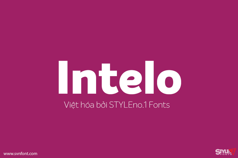
[Trả phí] SVN-Intelo (16 fonts) – Việt hóa
Intelo was created with the single idea of redefining what makes a functional grotesque typeface nowadays. Its large x-height and letterforms with subtle elliptical finish...
Đọc tiếp...
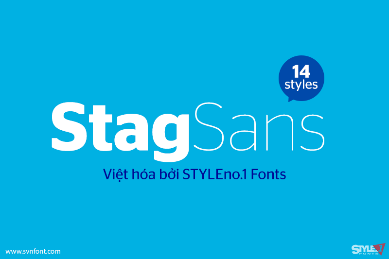
[Trả phí] SVN-Stag Sans (14 fonts) – Việt hóa
Stag is a typeface superfamily published by Commercial Type. It first originated as a slab serif, commissioned by Esquire for their magazine headlines. Since then...
Đọc tiếp...
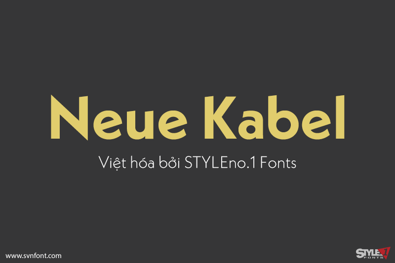
[Trả phí] SVN-Neue Kabel (18 fonts) – Việt hóa
Marc Schütz, a type design teacher at the University for Art and Design Offenbach, took on the challenge of updating and re-imaging the original Kabel®...
Đọc tiếp...
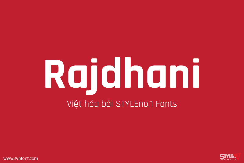
[Trả phí] SVN-Rajdhani (5 fonts) – Việt hóa
Rajdhani has modularized letterforms and supports the Devanagari and Latin writing systems. The squared and condensed appearance may be interpreted as technical or even futuristic....
Đọc tiếp...
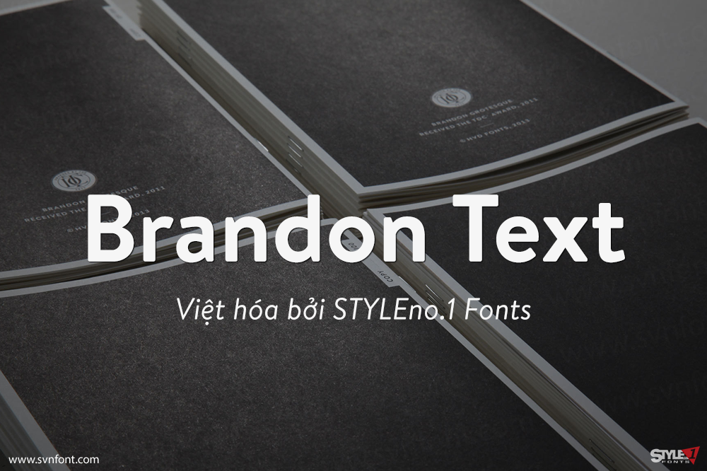
[Trả phí] SVN-Brandon Text (12 fonts) – Việt hóa
Brandon Text is the companion of the famous Brandon Grotesque type family. It has a higher x-height than the Grotesque version and is optimized for...
Đọc tiếp...
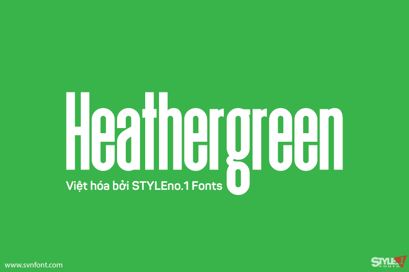
[Miễn phí] SVN-Heathergreen – Việt hóa
This relative of Deutschlander is about 20% taller and designed to take up more vertical space. Unlike most of our display fonts this one is...
Đọc tiếp...