HomePremium
Premium
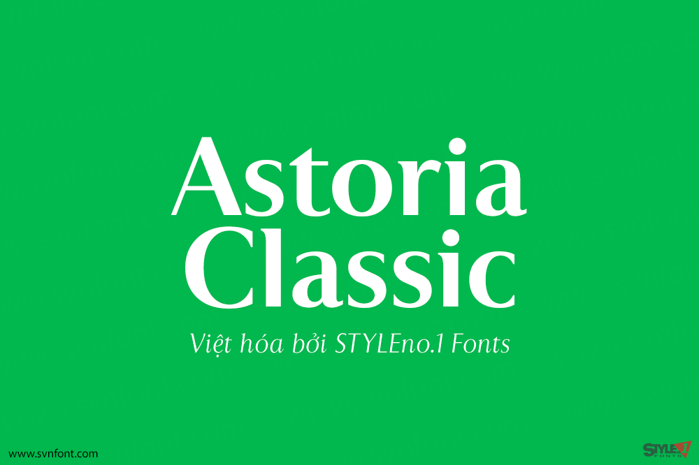
[Trả phí] SVN-Astoria Classic (8 fonts) – Việt hóa
The latest addition to the Astoria Range, Astoria Classic has the same basic characteristics as Astoria but with vertical stress. The characteristic subtle top left...
Đọc tiếp...
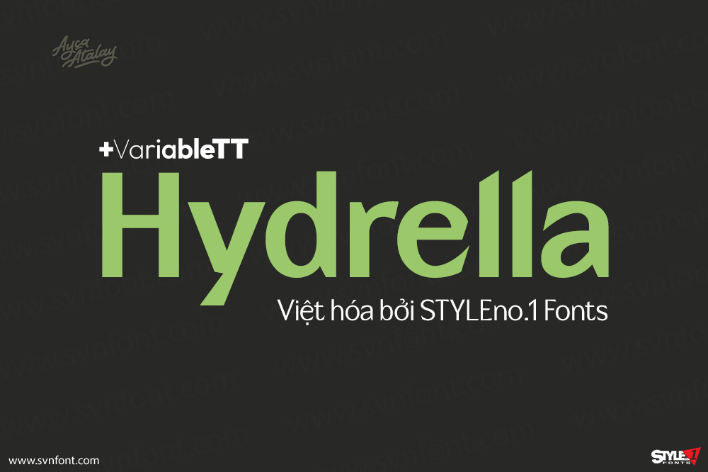
[Trả phí] SVN-Hydrella (9 fonts) + Variable – Việt hóa
Hydrella is a modern sans serif with sharp, unique features and moderately high contrast. Its easily distinguishable attributes provide just enough of a fresh new...
Đọc tiếp...
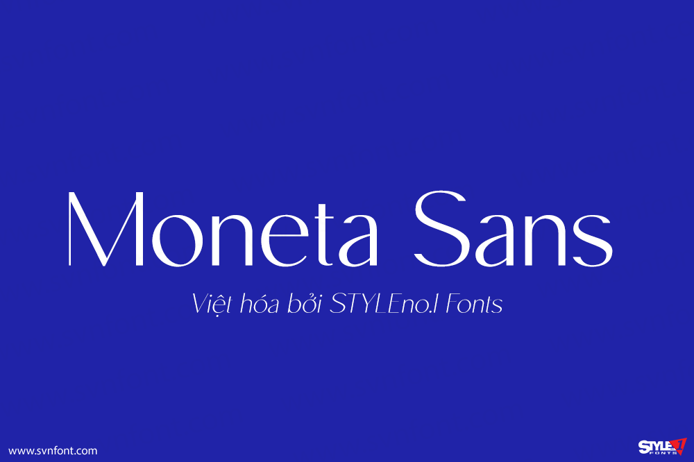
[Trả phí] SVN-Moneta Sans (8 fonts) – Việt hóa
Moneta™ Sans is an elegant transitional sans-serif with high contrast. Its morphology is based on the study of traditional broad-edge pen script. It comes in...
Đọc tiếp...
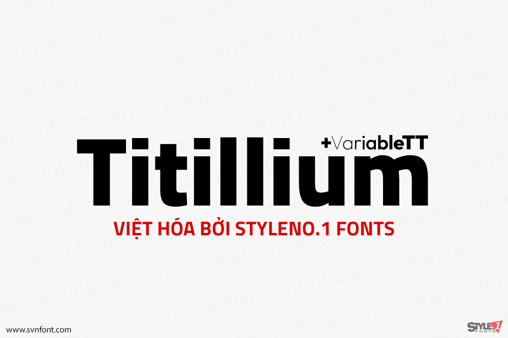
[Trả phí] SVN-Titillium (11 fonts) + Variable – Việt hóa
Titillium is born inside the Accademia di Belle Arti di Urbino as a didactic project Course Type design of the Master of Visual Design Campi...
Đọc tiếp...
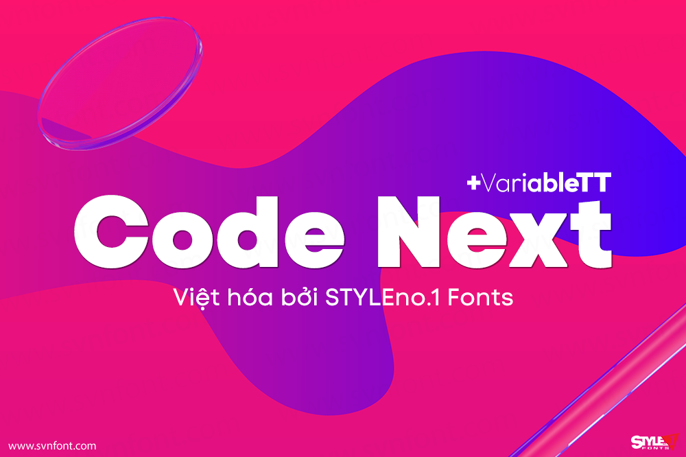
[Trả phí] SVN-Code Next (20 fonts) + Variable – Việt hóa
10 years later, one of the first geometric typefaces in our portfolio and a popular favorite of yours is rising to a whole new level!...
Đọc tiếp...
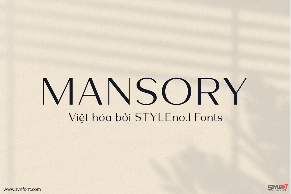
[Trả phí] SVN-Mansory (8 fonts) – Việt hóa
Mansory This is a modern contrasting and elegant sans serif font, which is presented in a upright and oblique style and also has 4 weights,...
Đọc tiếp...
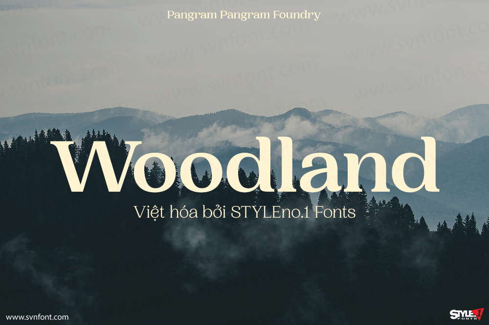
[Trả phí] SVN-Woodland (6 fonts) – Việt hóa
Woodland is a beautiful, curvy, versatile serif typeface with 6 weights. Each 2500 glyphs are crafted with great attention to details to make this font...
Đọc tiếp...
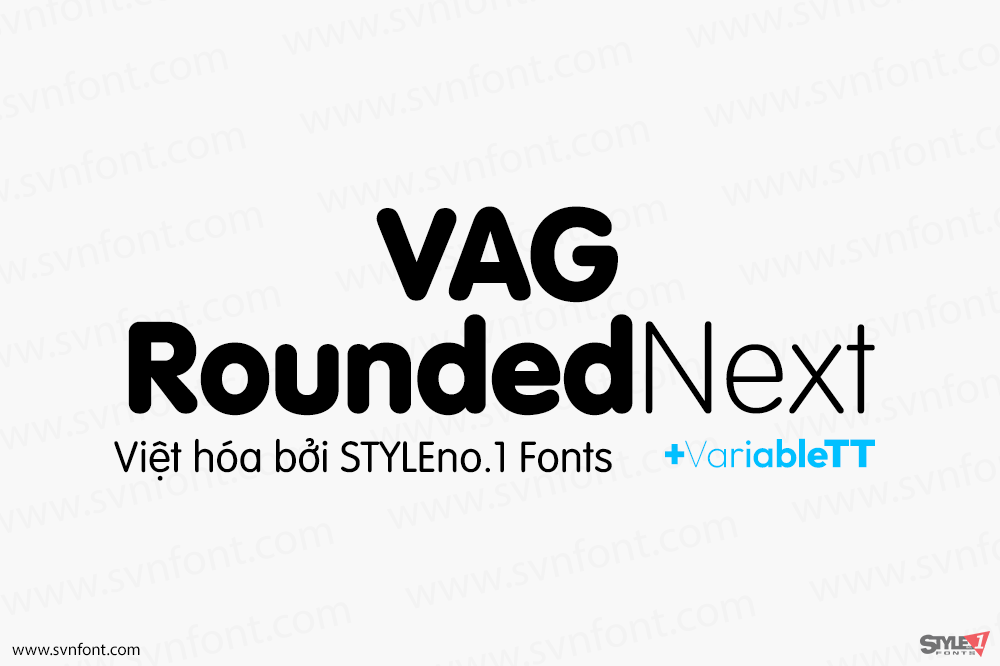
[Trả phí] SVN-VAG Rounded Next (20 fonts) + Variable – Việt hóa
VAG Rounded Next brings a classic 1970s typeface up to date, keeping all of its easy going, approachable personality but adding some much-needed versatility and...
Đọc tiếp...
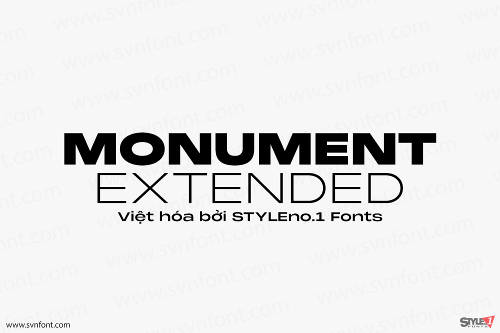
[Trả phí] SVN-Monument Extended (18 fonts) + Variable – Việt hóa
Monument Extended is a powerful quality extended typeface with great versatility. This extended font can be used for bold editorial statements, graphic heavy prints or...
Đọc tiếp...
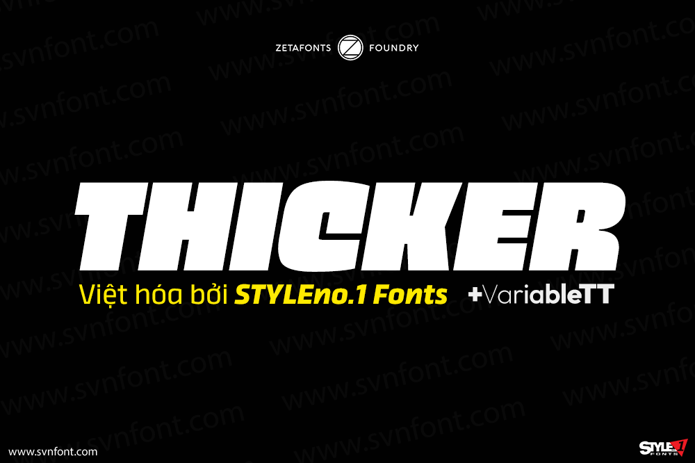
[Trả phí] SVN-Thicker (40 fonts) + Variable – Việt hóa
Thicker is a type-family designed for Zetafonts by Francesco Canovaro with Andrea Tartarelli. A geometric sans typeface on steroids, it was first designed in the...
Đọc tiếp...

