HomePremium
Premium
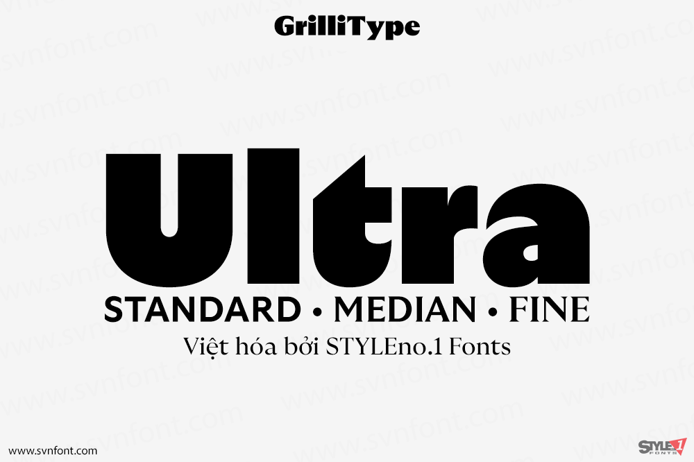
[Trả phí] SVN-Ultra (33 fonts) + Variable – Việt hóa
GT Ultra dances between the worlds of sans and serifs, fusing calligraphy and construction. The versatile typographic system combines the centuries-old context of serif type...
Đọc tiếp...
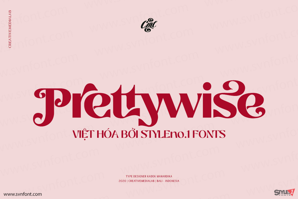
[Trả phí] SVN-Prettywise (10 fonts) + Variable – Việt hóa
Unique and beauty Modern serif family including 30+ ligatures and 100+ alternates to mix and match for a stunning display or header. This versatile family...
Đọc tiếp...
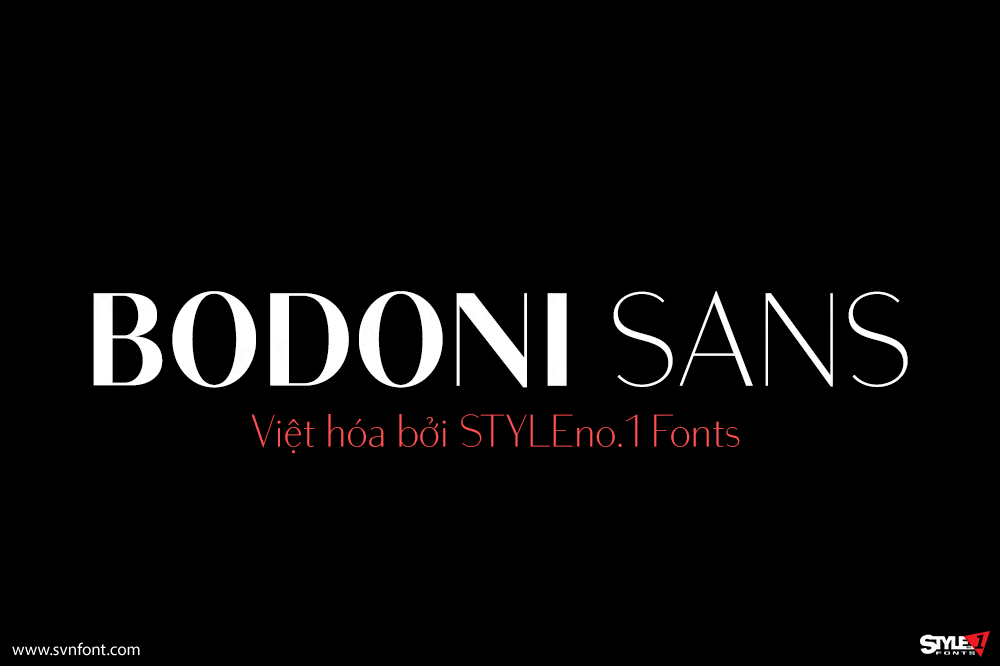
[Trả phí] SVN-Bodoni Sans (8 fonts) – Việt hóa
Bodoni Sans is a new classic built on the foundation of two centuries of history. Fresh and contemporary, while feeling familiar. Stylish and sophisticated, confident...
Đọc tiếp...
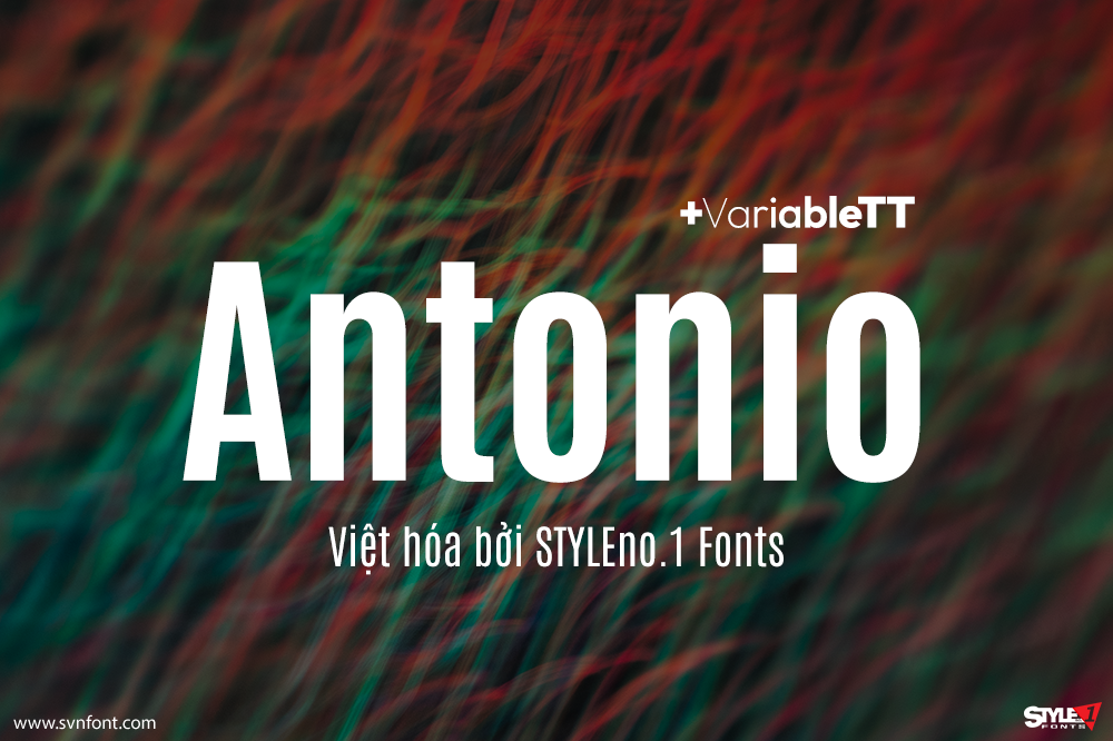
[Trả phí] SVN-Antonio (7 fonts) + Variable – Việt hóa
Antonio is a 'refined' version of the Anton Font. Anton is a single weight web font, designed specifically for larger display, headline and 'banner' use...
Đọc tiếp...
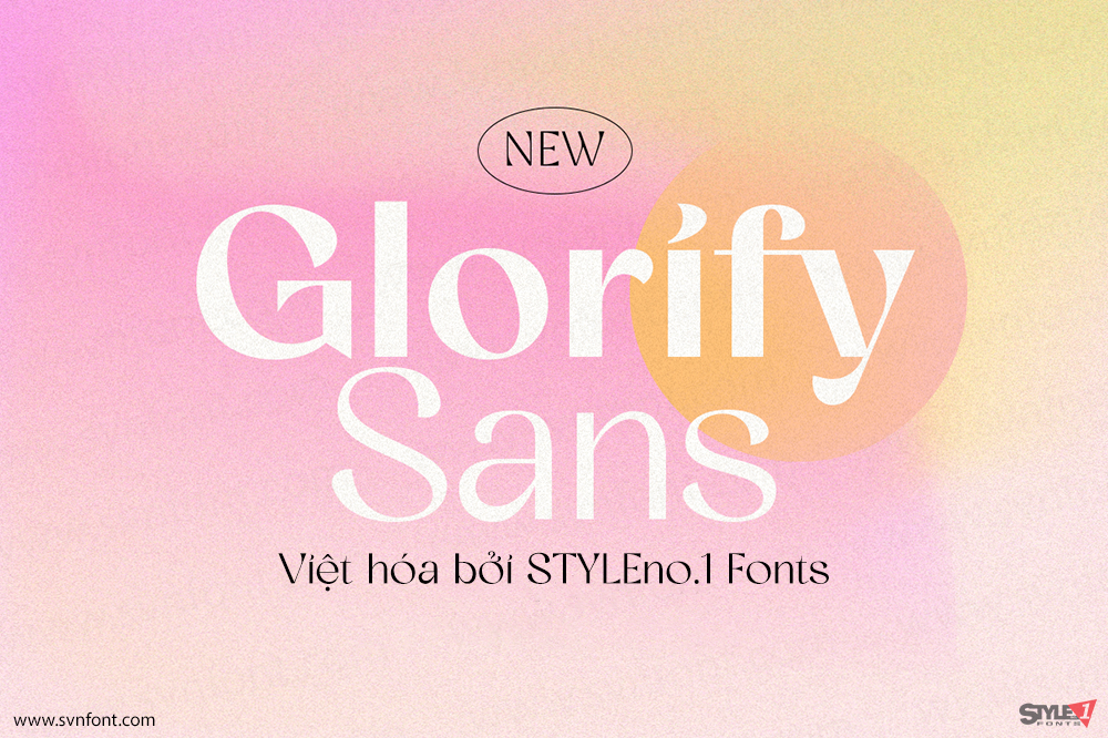
[Trả phí] SVN-Glorify Sans (8 fonts) – Việt hóa
lorify Sans is a sophisticated sans serif with many weight style to choose from. You will get 8 weight styles which you can play around...
Đọc tiếp...
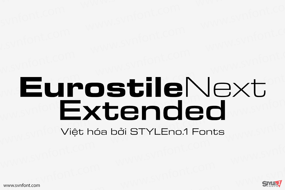
[Trả phí] SVN-Eurostile Next Extended (10 fonts) – Việt hóa
Eurostile Next is Linotype's redrawn and expanded version of Aldo Novarese's 1962 design. This new version refers back to the original metal types and to...
Đọc tiếp...
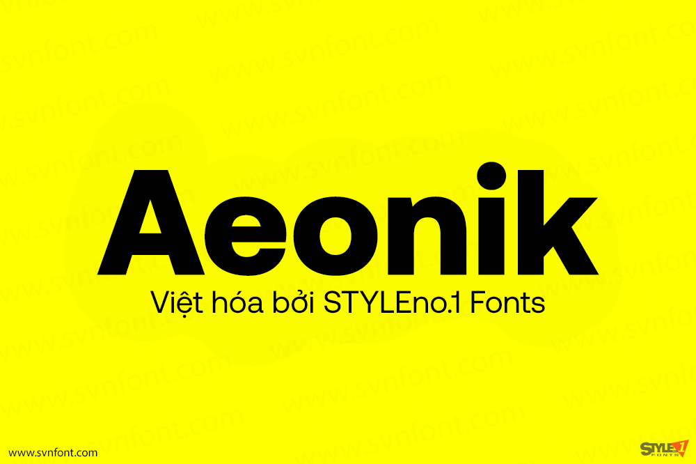
[Trả phí] SVN-Aeonik (14 fonts) – Việt hóa
Aeonik: a structural workhorse, crafted with mechanical detail. Conceived as a ‘neo-grotesque with a geometric skeleton’ Aeonik holds rigidity and coldness through strict perpendicular terminals:...
Đọc tiếp...
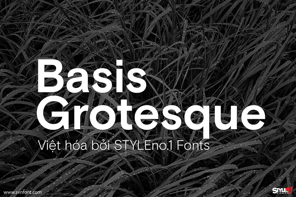
[Trả phí] SVN-Basis Grotesque (12 fonts) – Việt hóa
Originally drawn in a Regular weight for the comprehensive re-design of photography magazine HOTSHOE, we are pleased to release BASIS GROTESQUE commercially, some three years...
Đọc tiếp...
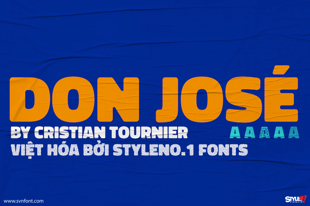
[Trả phí] SVN-Don José (5 fonts) – Việt hóa
Don José, from Cristian Tournier, is a sans-serif family with a high box, designed for holders. This font family includes 5 styles: Black, Roots, Mustache,...
Đọc tiếp...
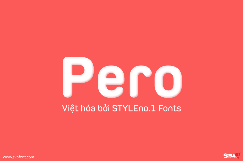
[Trả phí] SVN-Pero (7 fonts) – Việt hóa
Pero is a condensed rounded sans-serif family designed by Ryoichi Tsunekawa and the whole family consists of 7 weights from ExtraLight to ExtraBold.The range of...
Đọc tiếp...

