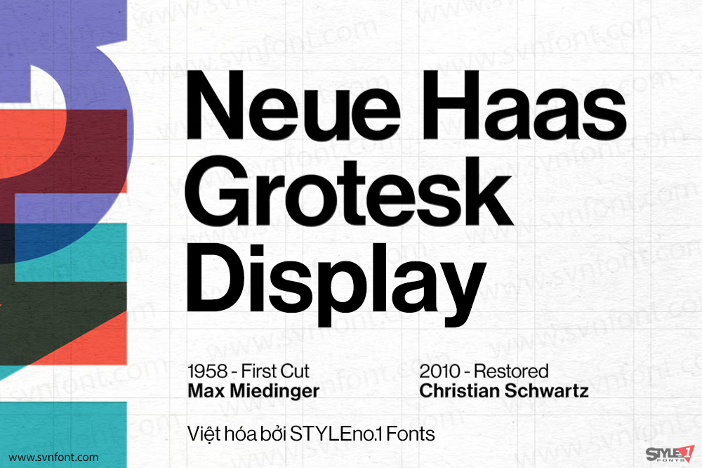
Sans-serif
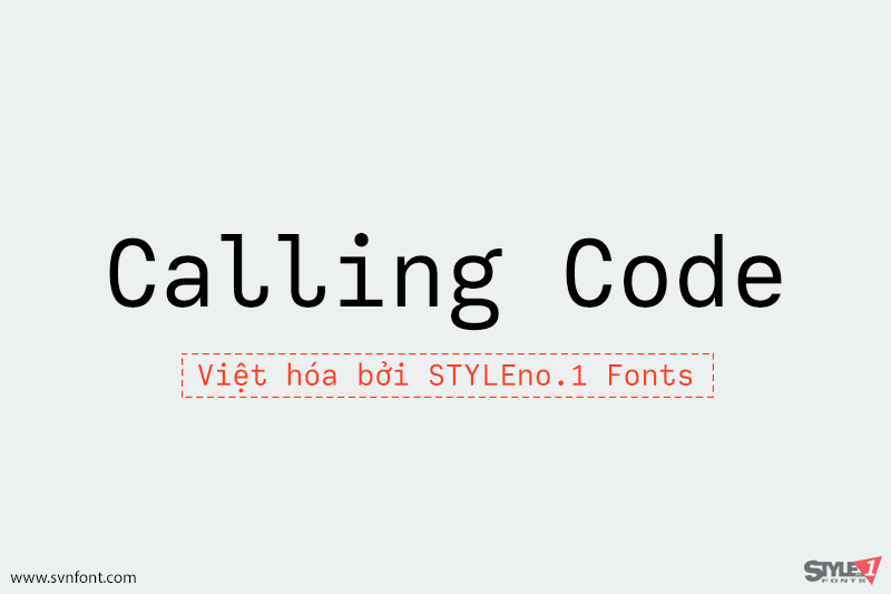
[Trả phí] SVN-Calling Code (4 fonts) – Việt hóa
Calling Code — very nice monospaced font — 1. is a monospaced font family for coding and tabular layout. 2. simply consists of 4 style,...
Đọc tiếp...
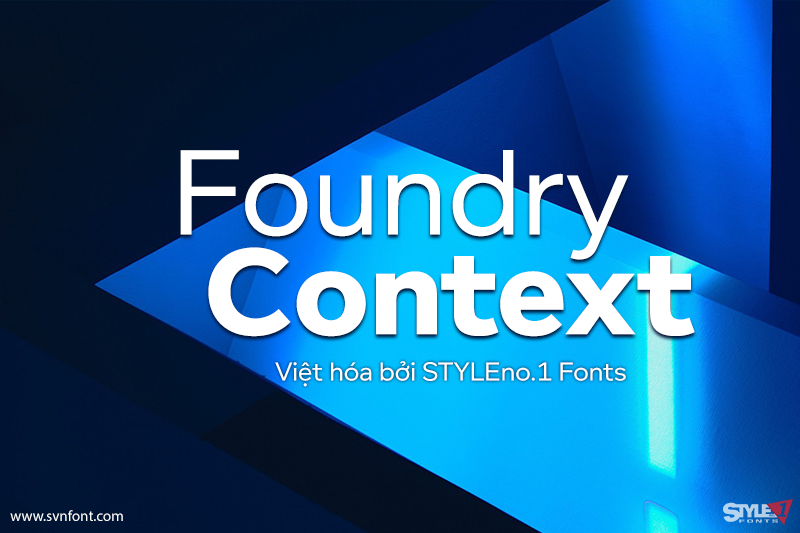
[Trả phí] SVN-Foundry Context (6 fonts) – Việt hóa
Foundry Context is a sans serif family designed to be universal in many contexts – hence the name. A ‘no-nonsense’ typeface, reminiscent of 19th century...
Đọc tiếp...
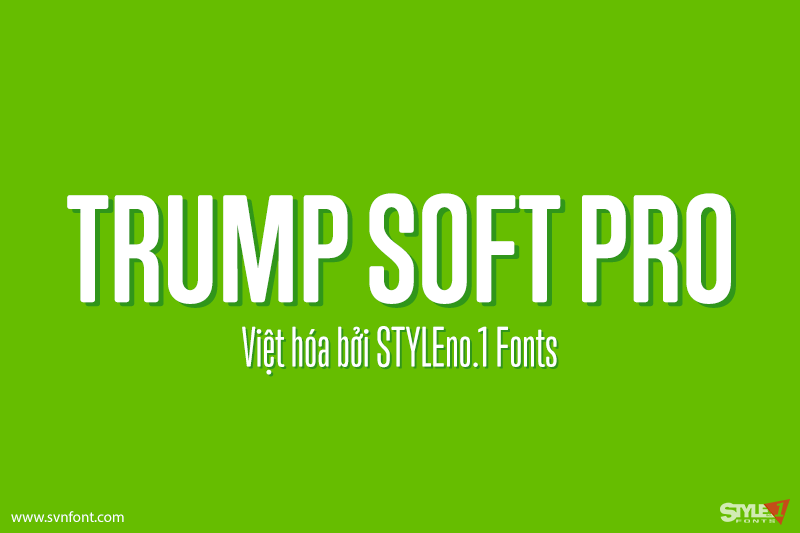
[Trả phí] SVN-Trump Soft Pro (6 fonts) – Việt hóa
Trump Soft Pro is the softer, round-cornered version of Trump Gothic Pro, the popular condensed gothic seen on films, magazines, book covers and frashion brands...
Đọc tiếp...
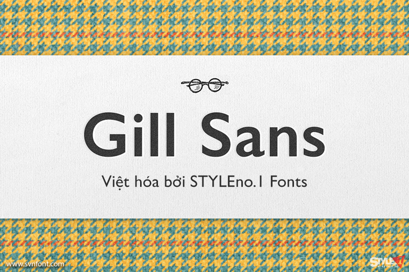
[Trả phí] SVN-Gill Sans (12 fonts) – Việt hóa
Gill Sans is a humanistic sans serif family that, while is considered by many to be quintessentially British in tone and concept, has been used...
Đọc tiếp...
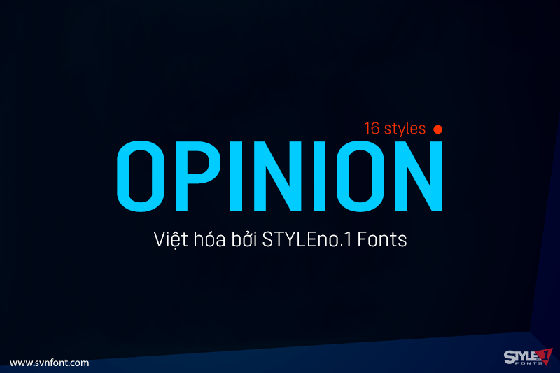
[Trả phí] SVN-Opinion (16 fonts) – Việt hóa
Opinion Pro is a geometric grotesque sans-serif typeface with extra-large x-height that comes in 64 styles. It is composed of 4 width variations, each in...
Đọc tiếp...
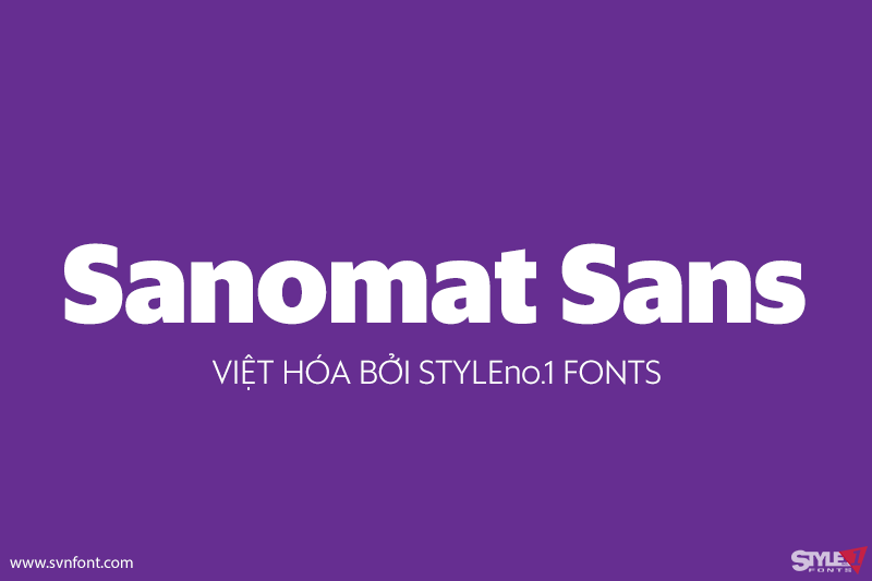
[Trả phí] SVN-Sanomat Sans (9 fonts) – Việt hóa
Sanomat Sans is a geometric sans serif with both display and text variants, originally designed for Sami Valtere’s redesign of Helsingin Sanomat, Finland’s most respected...
Đọc tiếp...
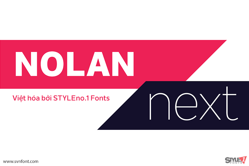
[Trả phí] SVN-Nolan Next (16 fonts) – Việt hóa
Nolan Next is a low-contrast humanist sans-serif with a large x-height and streamlined appearance. It is based on Nolan, but with a more compact letterforms...
Đọc tiếp...
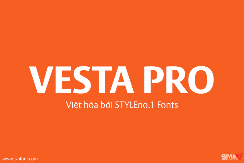
[Trả phí] SVN-Vesta Pro (14 fonts) – Việt hóa
In the late 1990s Gerard Unger won the assignment to design the signage system for the Holy Year celebrations to be held in Rome in...
Đọc tiếp...
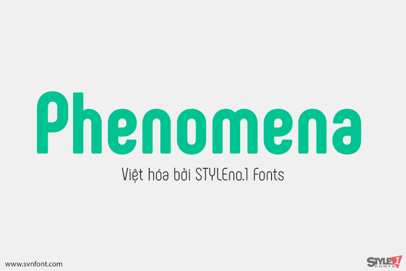
[Trả phí] SVN-Phenomena (7 fonts) – Việt hóa
Phenomena is a modern sans serif font based on round geometric shapes. It has condensed proportions and slight retro feel. The rounded corners soften the overall...
Đọc tiếp...
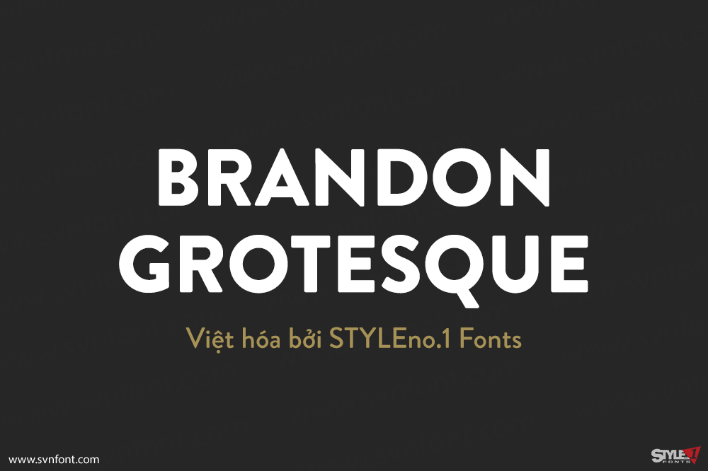
[Trả phí] SVN-Brandon Grotesque (12 fonts) – Việt hóa
Brandon Grotesque is a sans serif type family of six weights plus matching italics. It was designed by Hannes von Döhren in 2009/10. Influenced by...
Đọc tiếp...